
Logos are often the first point of contact between a brand and its customers. Because of this huge challenge, they can have a powerful impact on how a company is perceived. Some famous logos are instantly recognizable, even without the name of the brand alongside it.
These logos have become embedded in popular culture and continue to inspire designers and marketers around the world. Let’s take a deeper look at these 10 iconic and famous logos.
1. Adidas
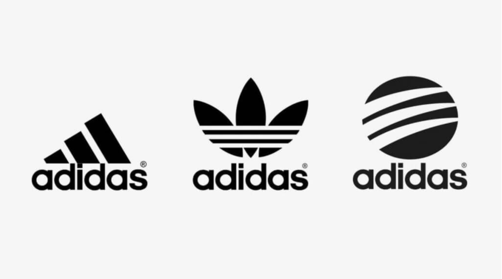
The Adidas logo, which features three stripes, was first introduced in 1967. The stripes were initially designed by the company’s founder, Adi Dassler, in the 1940s as a way to provide extra support and stability to the brand’s athletic shoes.
Of course, the logo evolved over time, with the three stripes becoming a prominent feature of Adidas’ branding. In 1971, the company introduced its now-iconic Trefoil logo, which features three stripes that converge into a single shape.
However, in the early 1990s, Adidas decided to update its branding to reflect a more modern and streamlined aesthetic. The company introduced its current logo, which features three stripes that are tilted upwards to represent the brand’s forward momentum.
2. Gucci
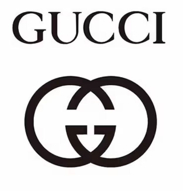
The Gucci logo features two interlocking G’s, which stand for the brand’s founder, Guccio Gucci. Gucci started his career as a porter in a luxury hotel in Paris in the early 1900s, where he was inspired by the elegant luggage carried by the hotel’s wealthy guests.
In 1921, Gucci opened his first leather goods shop in Florence, Italy, where he began producing high-quality luggage and accessories. Over time, Gucci’s designs became increasingly popular, and the brand quickly developed a reputation for luxury and sophistication.
However, in the 1960s, Gucci’s son, Aldo Gucci, began experimenting with new branding ideas. Because of this, h created the now-iconic interlocking G’s logo, which quickly became synonymous with the Gucci brand. Since then, we’ve gotten some minor tweaks on the logo. However, the two Gs still remain.
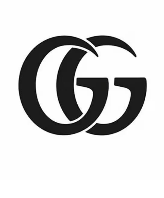
3. Unilever
The Unilever logo features a series of icons, including a dove, a palm tree, and a series of arrows. Because the whole icon is so storied, each of these icons represents one of the company’s core values and business areas.
The Unilever logo was first introduced in 2004 as part of a rebranding effort aimed at simplifying the company’s branding and visual identity. Finally, the new logo was designed to be more modern and dynamic, while still reflecting the company’s core values and business areas.
4. Disney
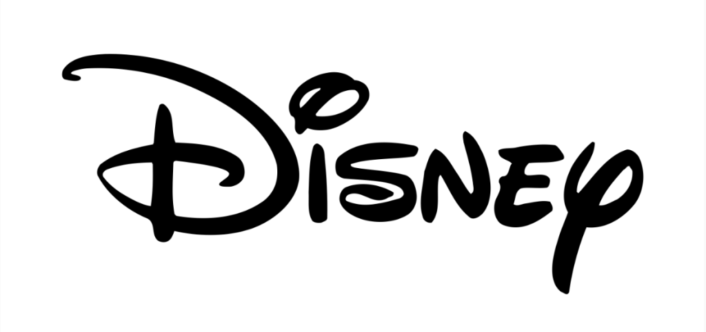
The logo features the word “Disney” in a distinctive, looping font, along with a stylized image of Cinderella’s Castle, which is based on the real-life Neuschwanstein Castle in Germany.
The Disney logo has undergone several changes over the years, with the earliest version featuring the word “Disney” in a more basic font and without the castle image. In addition, the castle image was added in 1985, as part of a rebranding effort aimed at emphasizing the company’s theme park and resort business.
The Disney logo has also appeared in various colors and styles over the years. In fact, this included a rainbow-colored version used to commemorate Pride Month.
5. Starbucks
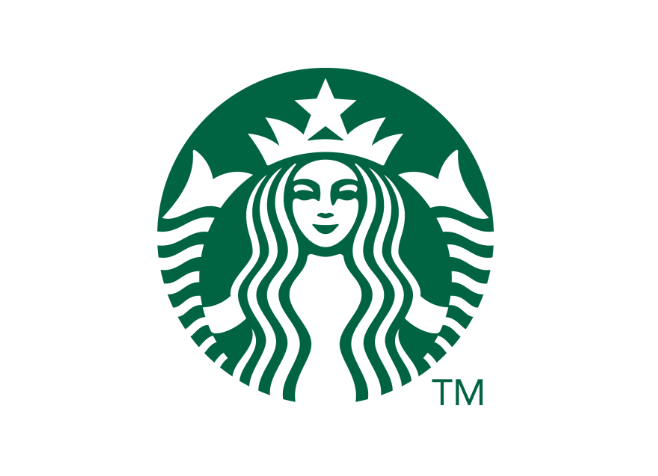
The Starbucks logo features a twin-tailed mermaid or siren. The logo was first introduced in 1971, when Starbucks was still a small, independent coffee roaster based in Seattle. The original logo featured a brown, simplified version of the siren, with no text or branding.
Over time, the logo evolved, with the siren becoming more stylized and the branding becoming more prominent. In the late 1980s, the logo was redesigned to feature a green and white color scheme, which has become synonymous with the Starbucks brand.
6. Wendy’s
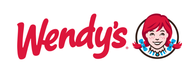
Wendy’s is a fast-food chain that was founded in 1969 by Dave Thomas. The restaurant was named after his daughter, Melinda Lou “Wendy” Thomas. In fact, the original Wendy’s logo featured an illustration of a little girl with red pigtails, which was based on Dave Thomas’s daughter, Wendy.
In 1983, Wendy’s underwent a brand redesign and commissioned a new logo. The new logo featured an updated version of the little girl with red pigtails, this time wearing a more modern outfit and surrounded by a wordmark. The logo was designed by Landor Associates, a global branding and design firm.
However, In 2012, Wendy’s underwent another brand redesign and introduced a new logo. Now, the new logo features an updated version of the little girl, but this time she appears to be “holding” the wordmark. The logo refresh was led by Tesser, a brand design firm based in San Francisco.
7. Olive Garden

Olive Garden is an American chain of Italian-themed restaurants that was founded in 1982. The restaurant’s logo features a simple yet elegant design, with the words “Olive Garden” written in green text with an olive branch above it.
The olive branch is a symbol of peace, which fits with the restaurant’s Italian theme of warm hospitality and a welcoming atmosphere. Additionally, the green color of the text and olive branch represents the freshness and naturalness of the ingredients used in Olive Garden’s dishes.
Now, the original Olive Garden logo featured a more detailed olive branch, with multiple leaves and olives. However, the current logo, introduced in 2014, features a simplified olive branch with a single olive and fewer leaves.
8. Ralph Lauren
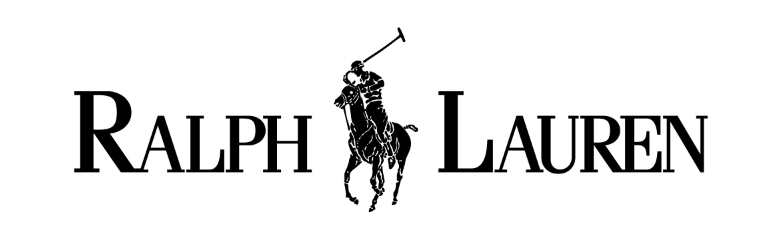
The Ralph Lauren logo features a polo player on horseback, holding a mallet and poised to hit a ball. The logo is simple, elegant, and instantly recognizable.
The story behind the logo is that it was inspired by Ralph Lauren’s love of polo. Polo is a sport that is often associated with the wealthy and the elite, and Ralph Lauren was drawn to its glamour and sophistication. He saw an opportunity to create a brand that embodied this same sense of luxury and exclusivity, and the polo player logo was born.
The logo first appeared in 1971 on the chest of a shirt in the Ralph Lauren men’s collection. Since then, it has become one of the most iconic logos in fashion. It has since been updated and refined over the years, but the basic design has remained the same.
9. IBM
IBM’s logo has evolved over time, but its most recognizable form is the one with the letters “IBM” in a horizontal striped pattern. Here’s a brief history of how the logo came to be.
In 1911, the Computing-Tabulating-Recording Company (CTR) was formed as the result of a merger between four different companies. The company produced a wide range of products, including scales, clocks, and punch-card machines.
The company changed its name to International Business Machines (IBM) in 1924. Plus, the company’s first logo featured the company’s full name in a circular pattern.
Next, in 1947, IBM’s logo was redesigned by graphic designer Paul Rand. The new logo featured the letters “IBM” in a horizontal striped pattern. Rand’s design was intended to be simple, clean, and modern. Over the years though, IBM’s logo has undergone some minor modifications, but the basic design has remained the same.
10. BMW
The BMW logo has a fascinating history. That’s because the logo, which consists of a circle divided into four quadrants with alternating blue and white colors, is often said to represent a propeller in motion. However, this is actually a myth.
In reality, the BMW logo has its roots in the company’s origins as a manufacturer of airplane engines. In fact, the blue and white color scheme was taken from the colors of the flag of Bavaria, the German state where the company was founded. Because of this, the circular design was meant to represent a spinning propeller, which was a common symbol of aviation at the time.
In fact, the company has stated that the logo is not intended to represent a propeller or airplane, but rather the colors of Bavaria. The design has gone through several revisions over the years, but the basic circular shape and blue-and-white color scheme have remained consistent.
Famous logos have an infinitely storied past. After all, these symbols are now corporate icons, but behind each one lies a story that often goes untold.
Read more: Designer Tips On How To Effectively Evolve Your Logo
We provide the fastest and most cost-effective alternative to agencies and freelancers by providing quick turnaround times, no limit revisions, and a comprehensive range of services.
Share your story with us so we can create a customized plan for you.


![[UPDATED] The 2024 Complete Graphic Design for Marketing Guide](https://www.dotyeti.com/wp-content/uploads/2021/12/2022.jpg)
")