_27")
Making the best landing pages can mean life or death for getting potential customers.
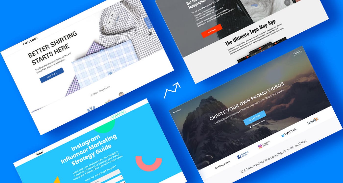
Landing pages are difficult to make. And making them conversion-driven is of the topmost importance. Landing pages function the same way, but they are more crucial because it is the first thing your customers see from your website (supposedly). If your landing page is designed carefully, it could get you more customers to click that ‘Buy Now’ button.
There should be a few essential content your landing page should contain. These content shouldn’t always used all the time. But a few tricks up your sleeve should work. In this brief guide, we listed down what the best landing pages on the internet did with theirs.
Two Important Concepts Make Up the Best Landing Pages
Basically it’s design and copy. But there’s more to it than most designers, copywriters, and audiences. A proper design and a good copy can lead your audience to click that sign up and subscribe button quickly. Take note, other visual and grammar aspects are still important. Yet the psychology and the art of making landing pages conversion driven. Just should follow our recommended steps.
While these apply most to designing conversion driven landing pages, it can also be used to upgrade your social media content. Social media is an emerging marketing field and could act as a conversion driven landing page when done right.
Design
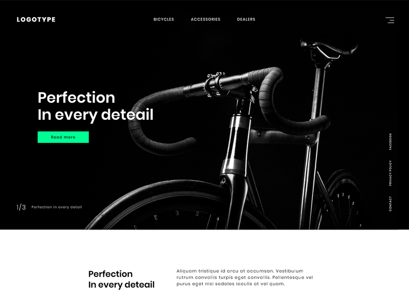
Laying out the design of best landing pages should keep customers engaged. From arrow pointers to tunnel vision, there are many design tricks that subconsciously drive your customers to look at certain points in a picture. Design inevitably holds a lot of weight when creating landing pages for conversion.
Arrows Right There
Believe it or not, when arrows are placed near button like “Click Here” and “Buy Now”, more customers actually click on those. That’s because arrows have been rooted deeply in our brains to signal that we should follow them. Arrows have been used in web pages and social media copies to direct customers to a call-to-action. When we talk about conversion, we want more clicks on this part.
Source | Sage Intaact
Take a look at this white paper landing page by Sage Intaact. For people who’d want to download the whitepaper, their attention would automatically direct to the sign up form. It’s placed strategically near the title so that skimmers would click on it immediately. This is one way of using arrows on your landing page.
Roads, Paths, and Pavements
Ever wonder why music videos contain a lot of triangles? Because triangles look like a road leading to somewhere or leading to a point. This is a good indirect way of commanding audiences. Roads, paths, and pavements could be used to make a statement. Take a look at this Road Dog Truck Sales landing page example:
The welcome message is at the bottom and as the road goes straight forward, it leads to the logo of the brand. By looking at this homepage, audiences would immediately focus on their logo and ad copy below it. The call-to-action button is placed properly on the road, again, highlighting it compared to the rest of the picture.
This landing page design has one the best content in it. Aside from the imagery, it has great color contrast (which we will discuss later on). But speaking of roads leading to somewhere…
Tunnel Vision
Encapsulating an image is one of the perfect ways to capture the attention of people. Just like when Porky Pig comes out of that Looney Tunes logo, the focus tends to be on him. Tunnel vision imagery invokes a focus that other designs cannot. Here an example:

Source | Getty Images
By looking at this picture, you’ll immediately notice the train. Nevermind the gracious oversight of the orange-uniformed workers, or the piper lipes, or the arch support sticking out at the sides. The encapsulation of this image captures the looming feeling of an oncoming train. This spotlighting or highlighting works well with the best landing pages.
Here’s another landing page example that does the same thing:

Source | True Logic
Though the copy is long and the page minimalistic, the attention is all on the text. Using a tunnel vision design would direct the audience to the attention-seeking center of the landing page, the lengthy text is immediately readable.
The Eyes
The eyes are often said to be the windows to your soul. And so, by the sight of them, your audiences resonate with it quickly. This is the reason why fashion photography and ad copies use babies with big eyes or often have models look into something. Example of which:

Source | Medium
This ad is a good landing page example for making use of the eyes. They look playful, They look as if they are wondering. And directs the audience to her thought bubble. It creates a personality for the landing page and shows the viewer a direction to the conversion driven spot, which would be the call-to-action portion.
Beautiful Appearances
Remember those dental ads that portray people with missing teeth, often having copies telling you to look at the missing or added body parts? In line with having beautiful eyes is having beautiful appearances. While beauty is subjective and is often in the eyes of the beholder (pun intended), a social representation of beauty often goes best that resonates with the ad’s purpose.
The best landing pages take advocacy and social matters along with beautiful appearances. You can always make this work by incorporating these elements together.
Contrast
Going back to the Road Dog ad copy above, contrast should be taken note of when designing landing pages. The grayscale background behind an orange logo highlights the content over everything. While colors are chosen subjectively, contrast is important to make a page conversion-driven—especially buttons. Call-to-action buttons should also follow good contrast over the background so audiences would know where to click.
Source | Dribbble
Here’s a landing page example with high contrast. The CTA button appears clearly, the contrast of the image and the text gives both content enough room to be noticed. And one doesn’t overshadow the other. It’s a perfect example of a landing page.
Negative Space
The negative space is the unused part of a design and often designers overlook it. The negative space, white space, or empty space helps improve user experience. It helps achieve focus and eases readability.
Source | Medium
Copy
We use commanding voices when we write copies like Buy now, Check this out, Subscribe to us, Get a free coupon. These copies still work (and they work better with good design). And should still be used when needed.
When making landing page copies, remember that the audience sees this first upon visiting a website. And because of that, it holds the power of customer conversion. They should be clear and concise with what your product or service should be—or else they would drive your customers away.
“Get It Before Time Runs Out”

Source | Global News Wire
The concept of missing out and time running out are the best emotions to evoke on audiences. When something good is about to slip out of their hands, it creates a subconscious necessity for them to get that product—even though the need doesn’t exist yet inside their heads.
“We Only Have a Few Stocks Left”
Scarcity also drives customers to buy something. This concept is similar to exclusive editions, limited editions, sale prices and such. The concept of products running out is often seen in online shopping like Amazon and eBay. The same thing can be applied to your landing pages. It works because customers wouldn’t want to miss out on it. And with landing pages, it’s the first thing you customer would see.
“Try It for a Month, Free!”

This ad by Shopify is a good example. A trial for a product or service without commitment would be a win-win situation for your customers and your business. Product trials would often lead to actual sales with satisfied customers. Remember how Netflix and Spotify got a billion streamers? It’s because of free trials.
A chance to try your product or service for free is often attractive to customers. Just make sure they would be satisfied, or else this tactic would backfire.
“You”
Did you know Apple uses the word “you” over 80 times in their copies? That’s because the power of saying you makes the whole copy less academic and more conversational. Audiences have a voice inside their head that speaks whenever they read what it is written on your landing page. So make you use of the word ‘you’ as often as necessary.
The Key to the Best Landing Pages
So, the next time you create a landing page, keep these tricks up your sleeve. Most of the conversion comes from these pages. And with all the pages we collected or studied, at least 2 or 3 of these appear on their pages.
But if you find yourself having a difficult time making innovative landing pages, we’ve got something that will pique your interest. You might want to consider unlimited designs priced for a month!
Yup, it’s true—as many designs you want in a whole month. That’s DotYeti for you. We provide graphic design solutions for your every marketing need—landing pages, custom illustrations, widgets, and more. Sign up today and get started for as low as $449 a month!
![[UPDATED] Why DotYeti is The Best Graphic Service Provider in 2024](https://www.dotyeti.com/wp-content/uploads/2022/01/2022-2.jpg)
")