
The Fanta rebrand comes at the heels of other major legacy rebrands. To name a few, Pepsi, 7-Up, and even Nokia have all unveiled new brand identities in 2023.
This time, it’s everyone’s favorite orange-flavored soda, Fanta.
The direction of the rebrand was led by Coca-Cola’s in-house design team, with design input from the following designers:
- JKR for packaging and imagery
- Lucas Wakamatsu for illustrations
- Gretel for motion identity
- Colophon for typography
- Tim Marsella for lifestyle photography
- Martin Wonnacott for product photography
Here’s how Coca-Cola gave its second-oldest brand a facelift.
Bye-bye, orange
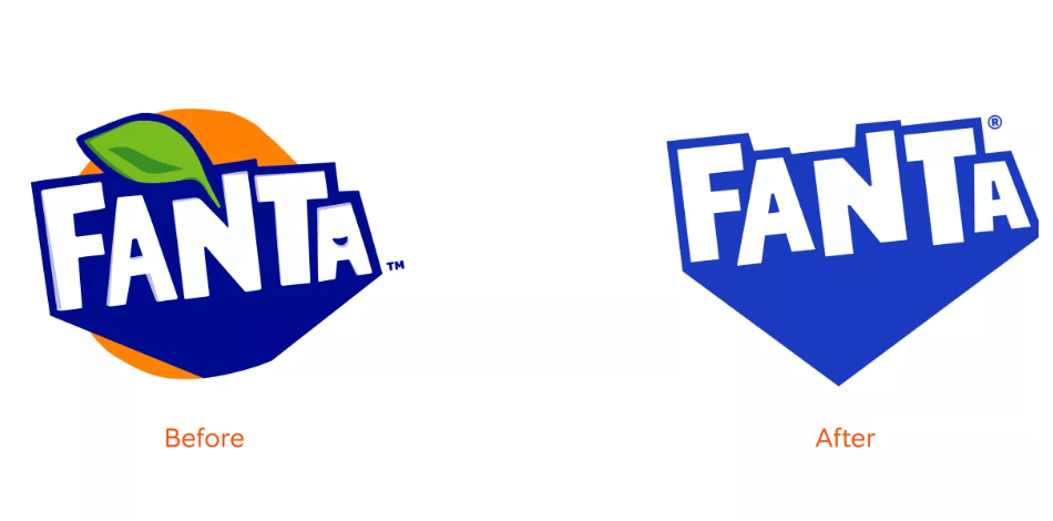
Photo from The Coca-Cola Company
After years of the iconic orange symbol, Fanta is bidding the citrus fruit icon goodbye. Gone is the iconic orange and green leaf, instead, they have updated it into a simplified version of the wordmark.
The typography was also slightly updated, replaced with a lighter hue of blue and a more trendy, 2D typeface.
Like other rebrands, Fanta has adopted more flexible brand colors. Its background color changes depending on the flavors that they present. The result is a rich palette of colors ranging from orange (OG orange flavor) to purple (grape flavor)
Along with the change in background, the wordmark is accompanied by an illustration of the fruits, as well as a water drop-shaped splash that changes color depending on the flavor.
A more playful Fanta
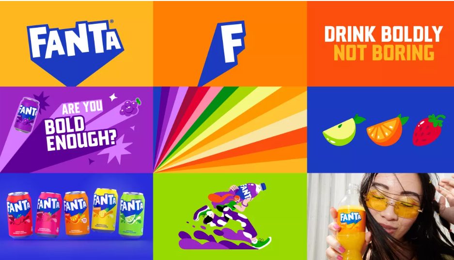
Photo from The Coca-Cola Company
‘Spontaneous play’ is at the heart of Fanta’s 2023 rebrand. With bright colors and an almost funky feel, it’s hard not to look at it and not be reminded of your favorite Cartoon Network show in the early aughts.
It’s a small and subtle nod to the GenZ nostalgia craze, perfectly capturing the brand’s young and fun brand message.
Product photography and brand illustrations also emphasize the young and refreshing vibe.
Overall, the new Fanta is bold and vibrant, with striking color combinations and bold visual imagery that celebrates its dedication to playfulness.
Branding for a global market
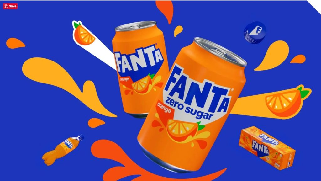
Photo from The Coca-Cola Company
In a press release, Lisa Smith, the global executive creative director of JFK, said their team was “inspired by the idea of bringing playfulness to consumers of all ages when we started to ideate around how to bring the brand’s purpose to the masses.”
Fanta has always adopted multiple flavors depending on the country it’s distributed in. For instance, Fanta drinks outside the US have real orange juice, while the American version has none. They also add regional tweaks to their flavors, depending on the area.
Fanta is a sub-brand of The Coca-Cola Company, home to other consumer goods brands like Minute Maid, Sprite, and Powerade, to name a few.
And that’s the whole Fanta rebrand explained. We love how legacy brands are embracing a more playful and young brand direction.
What do you think of Fanta’s new look?
DotYeti provides the fastest and most cost-effective alternative to agencies and freelancers by providing quick turnaround times, unlimited revisions, and comprehensive services. Get to know our scalable unlimited graphic design model today.
Share your story with us so we can create a customized plan for you.


")