
Netflix’s runaway hit Squid Game is set to become its most watched series of all time! The internet sensation has spawned viral memes and conversations about socio-economic issues that feel increasingly relevant. For example, financial debt, class divide and addiction are just a few of the topics that the show touches on. The logo design in Squid Game has received in return also a lot of attention.
In line with the skyrocketing interest, critics are praising the fantastic art direction. In particular, how the different designs contribute to its surrealist horror take on innocent children’s games. As a result, many viewers are curious to know more about the hidden meanings behind the logo.
Therefore, if you want to know more about the mysterious symbols and get your own FREE Squid Game business cards… then read on!
>> Let’s Start Talking About Affordable & Scalable Design for You <<
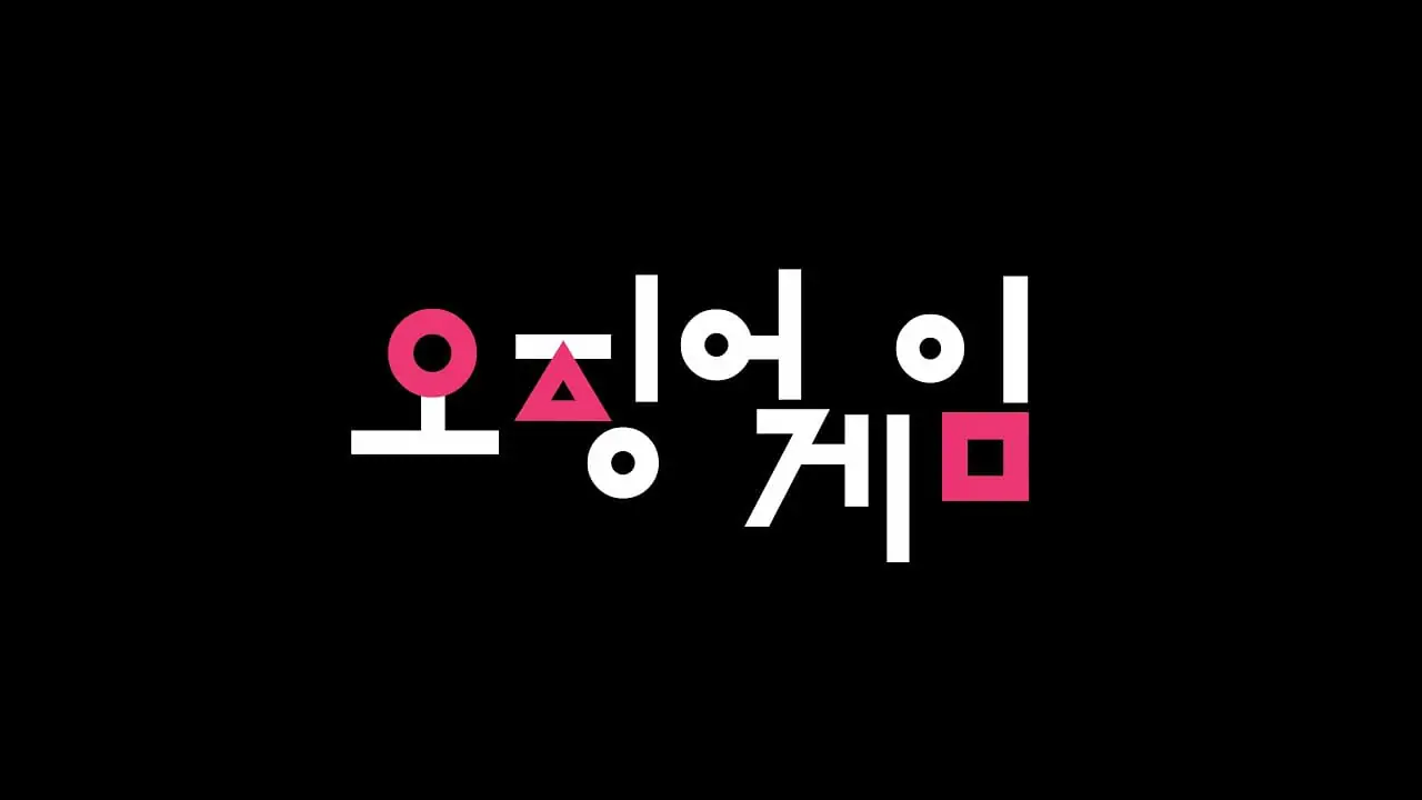
Squid Game’s Logo Design Explained
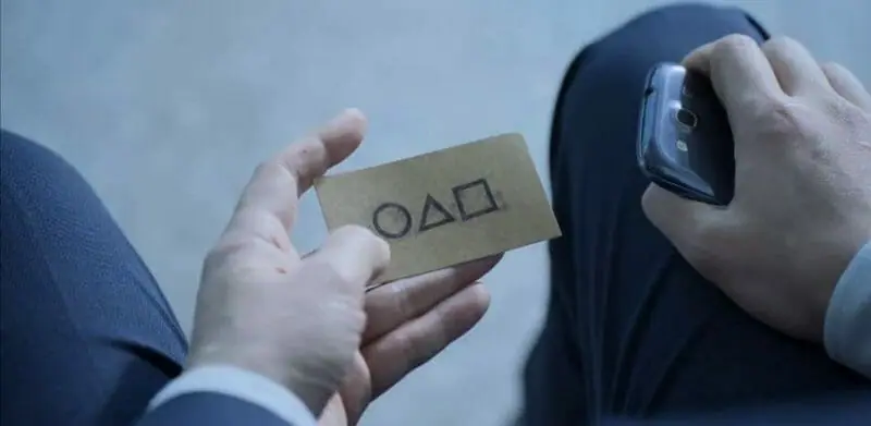
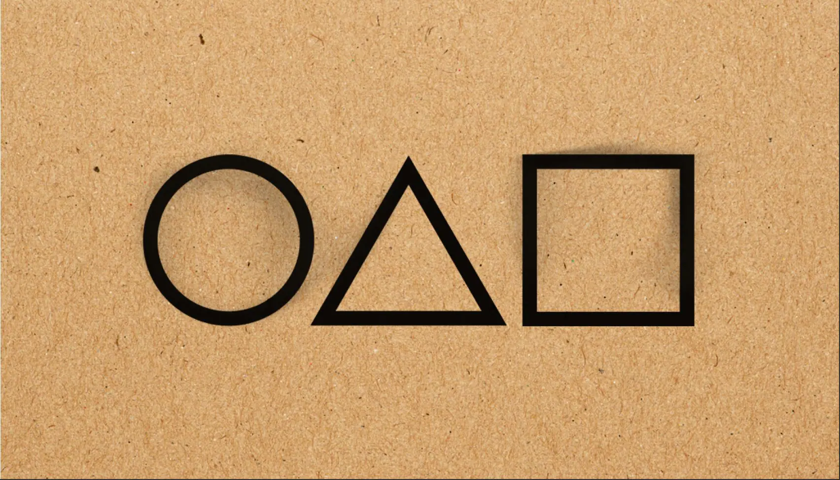
The symbols on the calling card bring to mind a game console– think PS4 or XBox. This is a perfect reference to the six games that the contestants are forced to play.
However, there’s also another use for the symbols. They’re actually letters of the Korean alphabet (Hangul) that together spell out the initials OJM. This is short for Ojingeo Geim– or Squid Game!
In addition, the shapes are part of Squid Game’s floor markings. They seamlessly transform into the title of the show in the opening sequence.
Other meanings
Still, netizens continue to dive deeper into possible hidden meanings of the logo.
For example, K-pop fans were quick to notice that the symbols were remarkably similar to girl group LOONA’s logo. And other eagle-eyed viewers spotted that the symbols could be a subtle nod to the Korean reality show, We Got Married. This is a show where Korean celebrities partner up to compete challenges together. Coincidence? We think not! Alliances form and break throughout Squid Game as the competitors try to outsmart each other to win the life-changing prize money.
Our take on Squid Game’s Logo Design
The logo design of Squid Game is a prominent example of how designers use symbols to communicate multiple ideas. While the shapes are the initials of Ojingeo Geim, they can also symbolize the use of games in the show’s plot.
Moreover, the logo is purposefully kept simple. There are no words to describe the mysterious organization behind Squid Game.
Furthermore, the colors are restricted to black, white and pink. In particular, pink is an interesting choice. While black and white are monotone colors, pink is a cheerful and bright one. Therefore, this contrast could hint at the dark twist on playground games. Overall, this creates an aura of mystery and suspicion. In other words, the logo gives nothing away and protects the game from outsiders.
Free Downloadable Squid Game Business Cards
Squid Game’s excellent logo design is recognizable around the world. Enjoy these free downloadable and 100% customizable Squid Game business cards.
Hand them out to your friends, family and colleagues and watch their reactions!
Simply click on the buttons below to download the AI and PSD files!
DotYeti’s Logo Design & Branding Services
Are you looking to get logo and branding work delivered in the most seamless, cost-effective way?
DotYeti’s team of professional graphic designers blend visual art with engaging designs to connect with your target audience. And we do this in an affordable and scalable manner. Specifically, logo and branding design is covered in our premium plan. We conceptualize, research and design logo variations that best tell your story.
Take a look at our portfolio to see how we’ve reliably supported global marketing and branding campaigns.
And be sure to check out our pricing page to see all our affordable and value-packed services.
Is it possible to get a team of dedicated graphic designers at a cost less than hiring someone full time?
YES! We discovered how...


")