
There is no doubt that choosing a color palette for your brand is one of the most exciting aspects of building your business. Although choosing a color palette to represent your company shouldn’t just be out of impulse. It takes skill, understanding, and heavy research to pick the right colors that would last for a lifetime.
In this sense, colors are a useful tool that lets businesses instantly communicate and resonate with audiences.
What is a Branding Color Palette?
Branding color palettes usually consist of three to five colors that visually represent what the company, product, and service are all about. Some prefer to have one distinctive color while others prefer to go as far as ten.
You’ll see color palettes in different business elements such as:
- Logos
- Website
- Thumbnails
- Staff Uniforms
- Advertisements
- Product Packaging
- Menu and Catalogs
- Physical Store Theme
- Social Media Channels
These brand colors rarely evolve over time for each company no matter how many times they rebrand over the decades; this proves that a consistent execution of this ensemble guarantees that a brand will be instantly recognized upon sight. The colors are naturally ingrained in the audiences’ psyche—as if it’s branded into their minds.
Color Psychology Overview
Oftentimes, the first thing that comes to mind when choosing a color palette for the business is the owner’s favorite colors. After all, the business is the owner’s baby; a realization of their values and goals as well as an extension of themselves.
But to effortlessly establish your identity online, check out this summary of which emotions colors evoke and provoke to the viewer:
Warm Colors
1. Red
Red represents love, passion, and lust. On the contrary, it is also used as a color that represents warnings, danger, and anger.
2. Orange
They say that the color orange is a color that represents energy and positivity. It is also associated with warnings although they are less threatening than the color red.
3. Yellow
Considered the happiest color there is, the color yellow is closely associated with hope and joy.
Cool Colors
1. Blue
Blue is extremely popular amongst SME and corporate brandings because it represents honesty, peace, and loyalty. Although in some cases, the color blue is also associated with sadness.
2. Green
Green is the perfect color to use if you want to represent new beginnings, nature, or growth. But people also associate it with money, stability, and affluence. These are the most common elements of the color green.
3. Purple
The color purple has long been recognized as the color for luxury and royalty. Lighter purples on the other hand fall more on the romantic side.
Neutral Colors
1. Black
Most commonly associated with death and mourning, the color black also represents elegance and sophistication.
2. White
The best color to symbolize purity, innocence, and cleanliness is white.
3. Gray
Even though people see the color gray as a boring and lifeless color, it is also powerful, flexible, and sophisticated.
4. Brown
Brown is a dependable and stable color. It is also linked to represent nature, depending on the context.
5. Beige
Considered as another flexible color, beige is a warm and cool color that adds its own psychological influence to the overall appearance of the design.
Branding Color Palette Examples
1. DotYeti

For one, DotYeti’s brand colors are in different shades of blue. The question now is, how does looking at the Blue Fella make you feel?
Does it subconsciously make you feel safe and secure knowing you’ll be in good hands? Or maybe it fills you with a sense of wonder as if you’re diving into a sky full of dreams and imagination—of creativity.
2. Coca-Cola
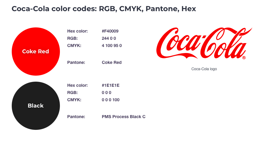
Image from US Brand Colors
How about Coca-Cola’s feisty black, red, and white color? Doesn’t it make you feel like you’re drinking a soda fit for kings?
3. The Pride Flag
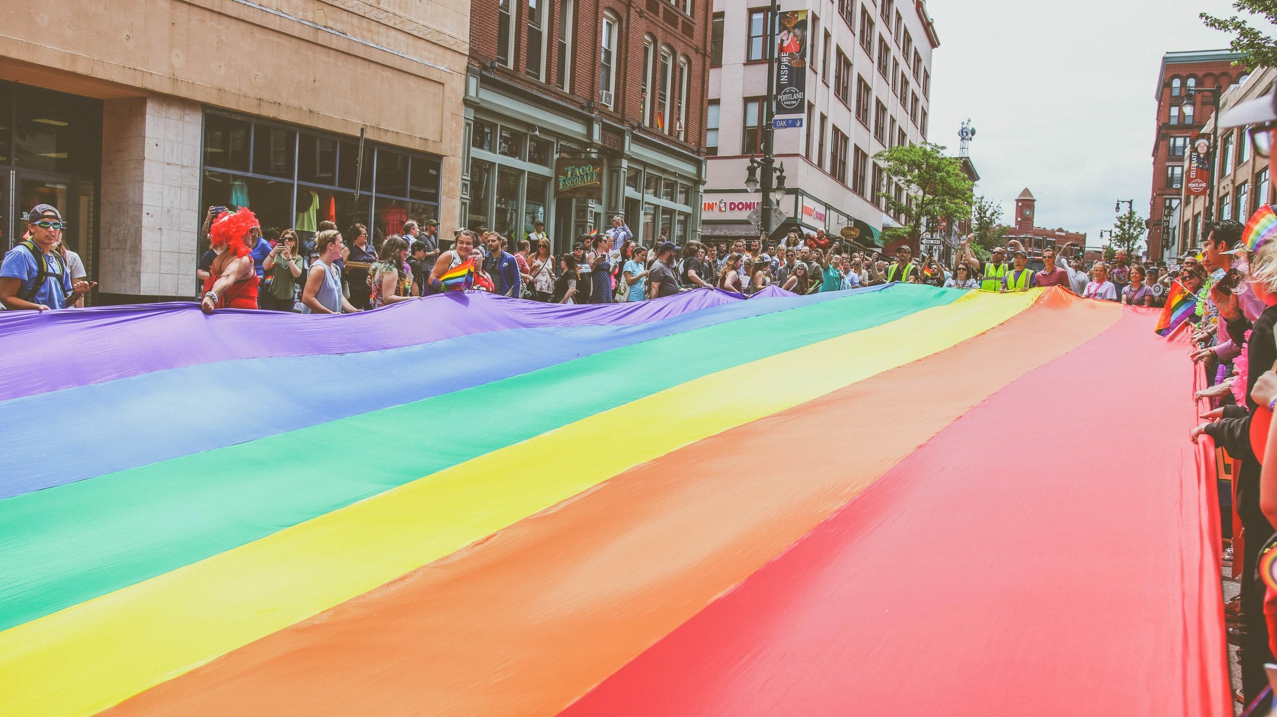
Or what about the pride flag’s colors? It effortlessly makes you feel included and the colors are so inviting that everyone—even if they’re not part of the LGBTQ community—wants to join in and support the members at all cost.
Its iconic colors represent healing, diversity, power, life, and harmony all in one. Even though it has a lot of meaning tied to it, the final output still works and it is well known and loved all around the world.
Choosing Your Brand’s Color Palette

1. Establish your brand identity
Choosing a string of adjectives that describes your company, goals, and/or what you have to offer is the place to start. After all, these are the feelings you’ll want to elicit from people. Ask yourself these questions to pinpoint an answer:
- What is your brand’s story?
- What does your brand solve for your customers?
- Who are your primary and secondary target market?
- What do you want your customers to feel when they encounter your brand?
- Why do you think customers should choose your brand instead of your competitors?
The words you choose should also reflect your company’s core values. But rather than treating it as this mega-giant thing of a ‘company’, treat it more like a person with a clear personality.
2. Pick a primary color
Once you’ve established your brand identity, you can start exploring colors and their associated meanings. You may be intimidated by this process since it’s rare to come up with something original. What matters is that you stay true to your brand.
Your objective during this phase is to look for one color that best represents your business. Do you want it to look extremely cheerful? Or maybe you want it to look powerful? Align your objective with the color the best represents them.
Remember, that the primary color is used the majority of the time. This is the main color your brand will be known for.
3. Secondary colors
Secondary colors are used to complement the primary color. Choose at least two to three colors that go along with the primary color. You can use shades, tints, warm colors, neons, pastels, cool colors, or even contrasting colors to make your branding unique and modern.

Unlimited Graphic Designs with DotYeti
Now would be an excellent time to seek advice from veteran designers, don’t you think? Well, you’re in the right place! Here at DotYeti, we have graphic design experts who have mastered the art of business branding.
If you want unique designs that are supported by powerful colors, then take a peek at our pricing page today to know which package best suits your needs.
Can’t find the right one? You’re welcome to reach out to a Yeti to make a custom package that fits your budget.


")