The highly anticipated Neil Gaiman series decided to keep the original Sandman logo from the 1989 comic book series, albeit with a few changes. Though unsurprising, the fans’ reception to the Netflix series’ logo is understandable (if there is any conversation about it), but a deeper understanding of Netflix’s decision makes for a great graphic design case study. Memorable logos keep people tuning in, and people around the world have come to know and love The Sandman Logo well. As one of the most highly revered comic books, The Sandman garnered much critical acclaim from numerous critics. For those who are unfamiliar with the series—it made many best selling lists, a feat often rare for comic books or visual novels. The official Netflix Sandman logo design was revealed last 24th of September 2021. This built up anticipation for the official release of the TV show. The episodes dropped on August 5th this year, almost a year after the revelation of the official Netflix Sandman logo. But this successful adaptation tells a long and arduous journey.
The arduous journey of Neil Gaiman and The Sandman adaptations
Neil Gaiman fans know that he keeps himself involved with adaptations of any series he creates. There have been numerous attempts to put The Sandman on both the big screen and the silver screen. The earliest attempt Warner Brothers tried to make a Sandman movie was back in the 1990s. Back then, Gaiman was still finishing the comic books and he mentioned that “begged producers not to go through with it”. Over time, this proves to be a smart decision. Interest among producers to create an adaptation bounced between then and recently. Warner Brothers’ first big attempt for a movie was back in 2013 starring Joseph Gordon Levitt, but Levitt’s departure in 2016 signaled worry among fans and true enough, this adaptation didn’t happen either. Fast forward to present day, a substantial production of The Sandman adaptation finally came to be. Netflix’s The Sandman adaptation garnered critical acclaim and positive reviews among fans old and new. Now this short but notable success story may seem irrelevant to a discussion about the Netflix Sandman logo design, but a keen eye would notice that the logo remains relatively untouched despite many versions of an adaptation throughout the years. Among the many controversial changes with the series, the logo stood the test of time. This requires some analysis and explanation.
The Sandman logo explained
Taking a look at the Sandman logo, one would notice how it may look like a basic title card. But a closer analysis reveals much thought on relatively retaining the comic’s original logo for the Netflix Sandman logo design. For starters, it’s a much sought after fantasy series from producers and fans alike that the logo itself would be recognizable among many people. Hence, keeping the original design seems logical. But that’s not the main reason why this logo is important. 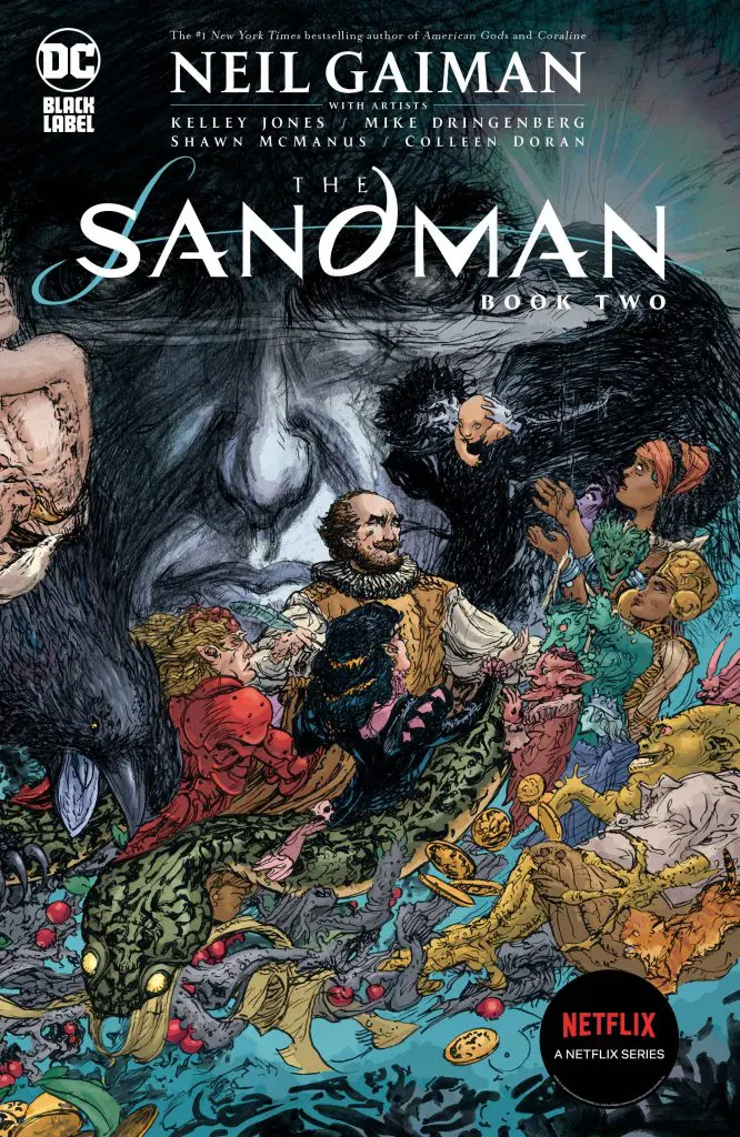 Dave McKean, a revered artist, illustrator, photographer, and essentially an all around creative well-known for his collaborations with Neil Gaiman, designed the original Sandman logo for the comic books. Gaiman pulled him out of retirement recently to do the end credits sequence for Netflix’s Sandman series, which is a bonus thing to check out for design. Comparing the original McKean’s comic book logo with the Netflix TV series logo, an untrained eye would think that both logos are similar. But a closer look reveals that Netflix changed the logo in a few ways. McKean, an artist who is very fond of collage, may have used at least 2-3 fonts for the logo (although this is speculative) judging by its look. McKean brought about all these dreamy, and sometimes downright creepy covert art and it was especially loved by Gaiman because his medium is mixed media photography and collage. In comparison, Netflix added texture to the logo and spaced out the letters so the height length looks the same making it look ‘less of a collage’. Further analyzing McKean’s original comic logo may have not worked for blockbuster TV series due to its final look compared to the modern changes Netflix has done.
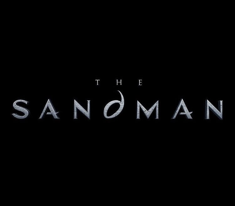
Symbolisms in The Sandman Logo
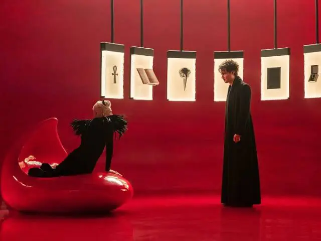 If you haven’t noticed the D, you should. The quirky letter ‘D’ found on the logo symbolizes much about the series and that the creators care about the fans on a design level. The letters evenly places the ‘quirky D’ at the center. The symbolic D (aside from the title itself) embodies one of the monikers the protagonist uses, which is Dream, and begins with the letter D. In addition, most of the Endless also begin with a letter D—Destiny, Death, Destruction, Desire, Delirium, Despair. But noticeably, the stylized D resembles Dream’s helmet. This helmet functions also as Dream’s sigil and these sigils are important to the story. In each of the Endless’ domains, they have frames holding their sigils or symbols (see picture above) and standing in the gallery and holding their symbol summons them. Destiny has his book. Death has her ankh, Dream has his helmet, and so on. Essentially, these sigils act like their own logos.
Netflix Sandman logo design proves logos are important
A well-crafted logo embodies not only amazing design, but also a subconscious effort that a brand (or a business) cares enough about their product to consider every detail. It shows that a logo is not only here to be recognized, but also to contain an important message about who they are. And The Sandman proves this across the test of time. In fact, it is good to note that it is one of the logos in any industry that remains unchanged despite existing on the radar of many people for many decades. The countless efforts of Neil Gaiman, the passion of the fans, and the vision of every producer, writer, and artist that went through every nook and cranny to put out a successful adaptation is personified through McKean’s immortal logo design. The decision to make the logo parallel to the comic book logo makes so much sense now that it may as well remain as a tribute to the amazing work of Dave McKean. This study of the Netflix Sandman logo design is a lesson to many creatives, designers and businesses to ensure that their logos convey their message and their story to their audiences. While they may be pleasing to the eye, logos function well if they speak to the audience when no one else speaks for your business. If we really think about it, the decision of any business’ logo design may as well be a glimpse of the business’ future. On the whole, a well-crafted brand logo acts as a business’ blueprint for success.
How to get good logos for your business
Unsure how to begin with logo design? Do you have many ideas but need some help in making it a reality? Look no further. Our subscription services enable you to get affordable and efficient graphic design services. Starting at $449 per month, you can get unlimited graphic designs. With unlimited revisions and a 14-day money back guarantee, DotYeti helps you get started on your logo designs with worries. Book us now for a demo!
")