
In case you forgot Nokia doesn’t make phones anymore, here’s a reminder. Last Sunday, the OG phone giant unveiled its first rebrand in 60 years. Besides a new Nokia logo, they’ve also transformed their business identity to move away from its once-iconic mobile phone ventures.
It’s a pretty big moment, especially since you don’t see legacy brands change their branding often.
Here’s the full story behind the rebranding, explained.
Explaining the Nokia Rebrand
It’s barely the first quarter of 2023, but we’re already seeing big brands changing up their visual identity. You see this with Pepsi’s 7UP as well as Burberry’s nth logo refresh. In short, there’s pressure to remold identities to signal new business ventures and evolved company values.
In Nokia’s case, they want to send a strong message that they don’t really do phones anymore.
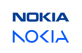
One of the most notable changes in the rebranding effort is the company’s new logo. This new look is characterized by vague shapes that, when put together, spell Nokia. Also long gone is the iconic Yale blue colorway, instead, the logo uses a kaleidoscope color palette that “cuts through the industry’s sea of sameness.”
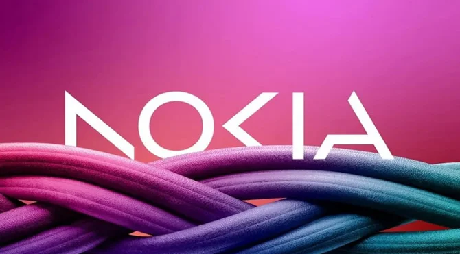
“This is a bold step in Nokia’s journey–and will help us get recognized by existing and prospective customers for the B2B technology innovator leader we are today,” said Melissa Schoeb, Nokia’s chief corporate affairs officer.
The rebranding effort was spearheaded by Lippincott, who had been working with Nokia for the last 15 years. The logo was released just ahead of Mobile World Congress in Barcelona.
In an interview with Bloomberg, CEO Pedma Luddmark said,” We want to launch a new brand that is focusing very much on the networks and industrial digitalization, which is a completely different thing from the legacy mobile phones.”
Read more: The Ultimate Guide To A Successful Rebranding in 2023
Read more: Designer Tips On How To Effectively Evolve Your Logo
Who is Nokia today?
Nokia’s primary work today is in the B2B technology industry. Specifically, it manufactures 5G equipment like routers and other telecommunications and network equipment. Apart from that, it also offers cloud services and solutions and gears for the automotive industry.
Before Apple and Samsung took over the mobile phone market with smartphones, Nokia was the leading brand for billions of users. It cemented itself in the global tech market by inventing the transistor and facilitating the first GSM call.
However, the company struggled to compete when smartphones came into the scene in the mid-2000s. In 2014, they sold their phone rights to Microsoft for around $7.5B. The deal ended in a disaster, with Microsoft selling the license in just two years.
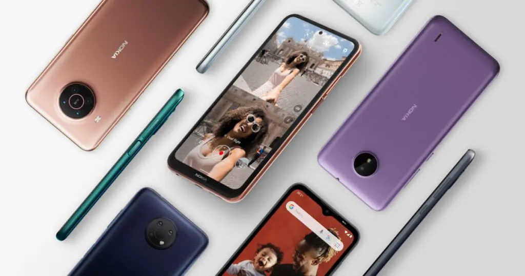
This isn’t the last time you’ll see a Nokia-branded phone though. After Microsoft sold the Nokia phone license in 2016, it was acquired by HMD Global, an independent Finnish firm that employs some of Nokia’s former senior executives. In fact, they recently came out with a new line of 5G phones all with the old Nokia logo.
The verdict
Since the big reveal, the online community has drawn comparisons with Kia’s logo, which they changed back in 2021. Here are the logos side by side for reference.
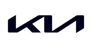
The use of abstract elements is similar, with the letters not quite there. The no-color scheme also allows for more flexibility and design collaboration.
Not everyone is a fan of the change though.
So, this is the new Nokia logo.
Sad. 💔 pic.twitter.com/paaE66GQFW— Alvin (@sondesix) February 26, 2023
From online comments, some people have lamented the shift to broken and vague fonts, as it somehow loses the authenticity and essence behind the original brand.
But what do you think about the new Nokia logo? And should brands stick with the abstract logo trend, or should they go the other way?
For more creative brain food, visit DotYeti’s blog. We’ve got the latest industry news, the freshest graphic design trends, and more insights you’ll love.
Interested in scalable graphic design services? Try a monthly subscription to DotYeti’s unlimited graphic design service. We employ a team of expert designers to offer limitless design requests and revisions for a flat monthly fee.
Share your story with us so we can create a customized plan just for you.

")