
It’s barely the first quarter of 2023, but we’ve already seen a couple of logo rebrands from big names. This time, it’s the Pepsi new logo that’s been making waves on the internet. And if you’re looking for a comprehensive Pepsi logo explanation, you’re in the right place.
Coming at the heels of major rebrands from Nokia, Wise, and Burberry, the new Pepsi look is an ode to its past versions in the 60s.
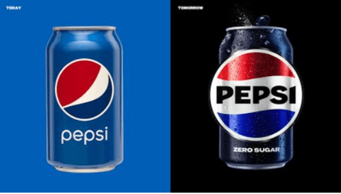
The logo was announced ahead of the company’s 125th anniversary this August. The new look will debut in the United States and Canada this fall, while the global distribution is set to start in 2024. We’ve only seen visuals for the new cans, but so far, we love it.
Here’s why.
Pepsi Logo History
Pepsi is a staple in every department store and in most fast-food chains. And that’s why we’re all familiar with Pepsi’s iconic blue and red color scheme. The familiarity may be due in part because its last rebrand was waaay back in 2008.
Credit to Pepsi.Co
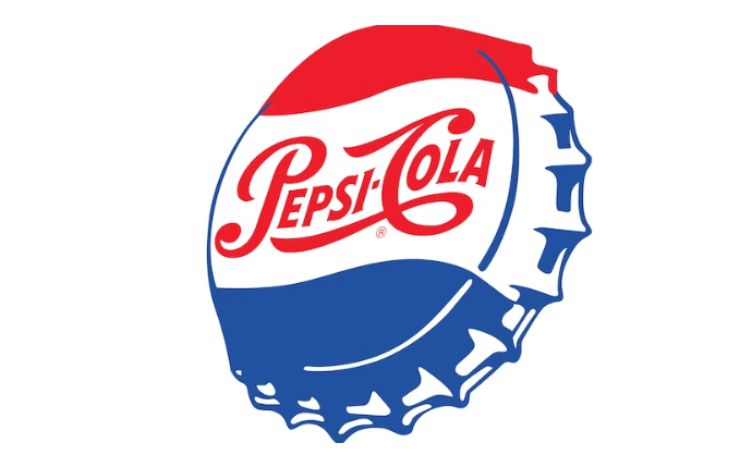
The old logo featured a minimalistic bottle cap logo with the iconic swirl, as well as a simple sans serif typeface and a muted color palette. Want to find the brand’s favorite typefaces? Read about the top font trends here.
Meanwhile, the new logo leans heavily into a darker color story. According to Pepsi, they added the “electric blue and black to bring contrast, vibrancy, and a contemporary edge to the classic Pepsi color scheme.” Apart from that, the new logo features a custom typeface that calls back to Pepsi’s signature bold and black lettering.
The integration of black also highlights Pepsi’s commitment to promoting Pepsi Zero Sugar.
Todd Kaplan, the Chief Marketing Officer of Pepsi remarked, “A lot of people don’t even notice the black is there.”
He added “It’s an intentional color we added in with Zero Sugar, which will be the lead brand we use marketing. It can act as a master brand statement.
Old-school Pepsi is back
With the hype around nostalgia marketing, it’s no surprise that the company is taking the retro route. In fact, the current logo draws heavy inspiration from the Pepsi logo in the 60s.
Since its establishment in 1898, the Pepsi logo has gone through several changes. It was only in 1950, that the iconic bottle cap was introduced. Sometime later, they added in the iconic black Pepsi typeface that we love today.
Pepsi’s old logo in the 50s
Did you love Pepsi’s retro look? You can take a look at the best Y2k-inspired branding here.
Legacies and beyond
Apart from its focus on Zero Sugar, the new logo also showcases Pepsi’s legacy in pop culture.
A significant feature of the new look is a Pepsi background display with a pulse. This signature ‘Pepsi pulse’ is an homage to the connection between the brand and music. Case in point: it sponsored the Super Bowl Halftime show for 10 years until Apple Music took over last year.
Over the years, it has also stayed consistent–often using artists in its largest ad campaigns. In 2021, the company founded the Pepsi Music Lab to help train and give opportunities to aspiring pop stars.
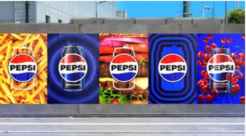
Besides that, the logo is also meant to be used in both print and digital ads.
Mauro Porcini, the company’s Chief Design Officer, said, “It looks like a badge that you can wear or put on equipment (but) is very aligned to the latest trends in terms of visual communications.”
And there you have it—a brief Pepsi logo explanation for the logo geeks out there.
DotYeti provides the fastest and most cost-effective alternative to agencies and freelancers by providing quick turnaround times, unlimited revisions, and comprehensive services. Get to know our scalable unlimited graphic design model today.
Share your story with us so we can create a customized plan for you.


")