
Dear Google, don’t take this personally, but there are some serious issues with your new logo designs for 2020.
Google’s new logos are all everybody is buzzing about. But if you haven’t noticed already, Google has decided to rebrand the names of their applications from the G-Suite to Google Workspace.
Applications like Google+ also got a makeover and were renamed Google Currents. It’s a subtle difference that frankly nobody would care about — if only they didn’t screw up the new logos along with it.
Look, we get it. As a graphic design company that handles hundreds of requests on a regular basis, we would know why brands need to reinvent themselves through subtle changes in their design without compromising the brand identity. We can understand the intent, and it is a good one.
Making logos isn’t a piece of cake either. It takes creativity, wit, and imagination to come up with images that represent an entire brand. So we can imagine the hours spent designing and redesigning and board meetings for the final approval that Google’s design team may or may not have had to go through before implementing these changes.
That said, you’d think the number one search engine on the internet would know how to create logos that the internet wouldn’t turn into a widespread meme.
Everything Wrong with Google’s New 2020 Logos
Devin Coldewey, a contributor for the tech blog Tech Crunch explains everything in detail as to why Google’s new logos are bad. The article breaks down the elements that make things problematic for the search engine’s design choices. From the color, shape, to what it does to Google’s brand. If you ask us, it’s pretty accurate stuff.
Here’s our own breakdown of the new highly debatable Google Workspace logos:
From the 2D Shadow Effect Theme to the Minimalist Approach
Trends come and go and usually, some companies don’t really pay attention to them. Google, however, has to be the company that’s on top of them. And for the past couple of years, they have been.

G-Suite: The Good Ole’ Days
The original G-Suite logos have been reliable and easy on the eyes since they first came out. They were professional, distinguishable, simple, and fit right in with the trend of subtle shadows to provide contrast to the two-dimensional logos. The subtle shadows also make the designs stand out more.
- Google Calendar’s style shows exactly that by giving the illusion of a flip calendar.
- Shadowing helped Google Drive’s Penrose (Impossible Triangle) become more distinguishable.
- They even helped highlight the “M” on the Gmail logo, which was witty for the fact that it was both a mail envelope and a huge “M” that stood for “Mail.”
Many other logos have followed this style at the time. It was solid and simple, which is why they kept them this way for the next few years. 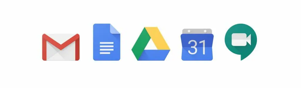
Google Workspace: Minimalist? Sure. Confusing? Definitely.
Now, Google Workspace has taken a turn for the minimalist approach, which is right on-trend. Less is more has become the rule of thumb for most logo designs, and it was about time that Google hopped on that. The concept must have looked good on paper since the vision seemed to make sense as you analyze what they’ve attempted to achieve. ![]()
![]() Every Google color was used on every logo in a similar fashion in order to stay cohesive and true to Google’s brand identity. For the most part, Google kept the shapes the same as to not shock users with the sudden change. The problem lies in the execution, which is visible in the trending image below.
Every Google color was used on every logo in a similar fashion in order to stay cohesive and true to Google’s brand identity. For the most part, Google kept the shapes the same as to not shock users with the sudden change. The problem lies in the execution, which is visible in the trending image below.
In a nutshell:
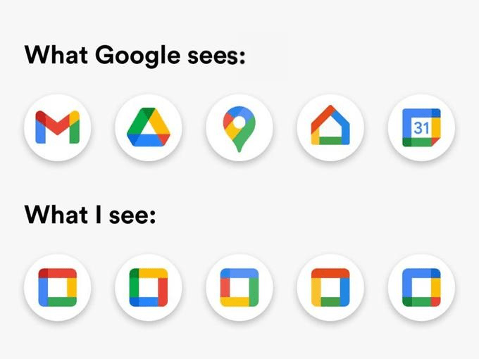 Thank you, Google. Now you’ve given people a tougher time to explain to their parents, grandparents, or older colleagues the differences between your applications. This was clearly not a subtle change since it’s caught the internet’s attention — and not in a good way. This blur test will point out the major flaw in this design.
  As it shows, G-Suite logos are distinguishable from one another. This makes navigating through the application easier for the user. Google Workspace, on the other hand, has made it tougher. You can just imagine the number of users who would mistakenly open Google Calendar instead of Google Drive. It’s not a huge problem, but it is an inconvenience. And if there’s anything Google should be on top of, it’s creating a convenient user experience for everyone on the site.
DotYeti to the Rescue: We Redesign Google’s New Logos of 2020
Nobody likes a badmouth with no substance. As a graphic design subscription service, we saw the need to put our money where our mouth is and find a solution for the new logos. Instead of casting a petition to Google executives to go back to the old design, we saw the need to capture exactly what Google was trying to do while still keeping things up-to-date. So here is DotYeti’s original design proposal for Google Workspace: 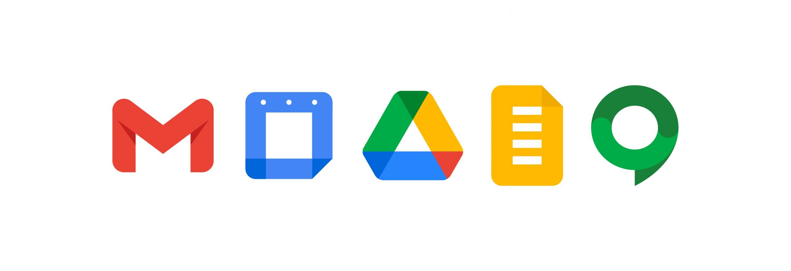
Not to toot our own horn here, but we think we hit the marks on this one.
Our brilliant design team took the intent of Google while still keeping true to the characteristics that made the original logo designs work. We got rid of the unnecessary idea to jam pack every Google color on each logo and stuck to its distinguishable colors from the original design. Here are the solutions we came up with:
Gmail
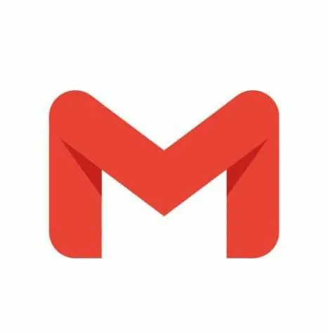 We kept the highlighted “M” because it is wit that you cannot simply get rid of. We still captured the idea of it being an illusioned envelope and kept the structure pretty much the same as the new one. Instead of the brand color scheme, we stuck to Google’s iconic red since it is so very closely associated with the application.
Google Calendar and Google Drive
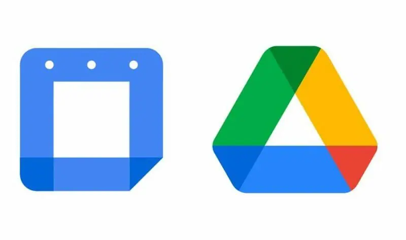 To keep these two applications distinct from one another, we decided to keep the clever design on Google Drive and make Google Calendar simply Google’s calming blue while adding calendar holes atop the square.
Google Docs
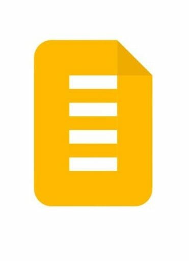 Initially, this logo was proposed to rule all Doc-related Applications which include Docs, Sheets, and Slides. Google has since abandoned this logo and reverted to make them all separate. If in case they were ever to change their mind and make this a reality again, our logo using the solid Google yellow might just do the trick.
Google Meets
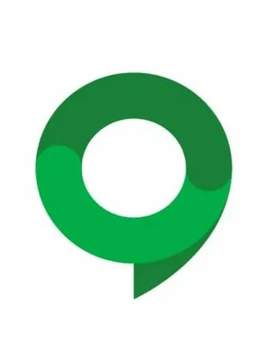 The cool new geometric design of Google Meets may be edgy, but it’s completely misleading. Instead of the chat aspect of it, they chose to highlight the Video Record icon in the center of their old logo. Google Meets does have a video chat option, but the main idea of the application is it’s used to chat, so it doesn’t make sense to get rid of the chat bubble. Plus, old users won’t be able to tell if this was the old Meets since the change of structure is vastly different from the original. So what did we do? We brought the little chat bubble buddy back.
 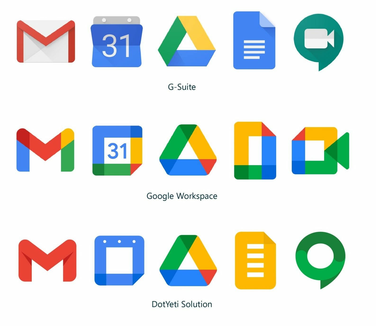 Together, our logos made each application distinguishable while still keeping true to the minimalist approach. If you take the blur test, you’d be able to distinguish our logos even more than Google’s new logos.
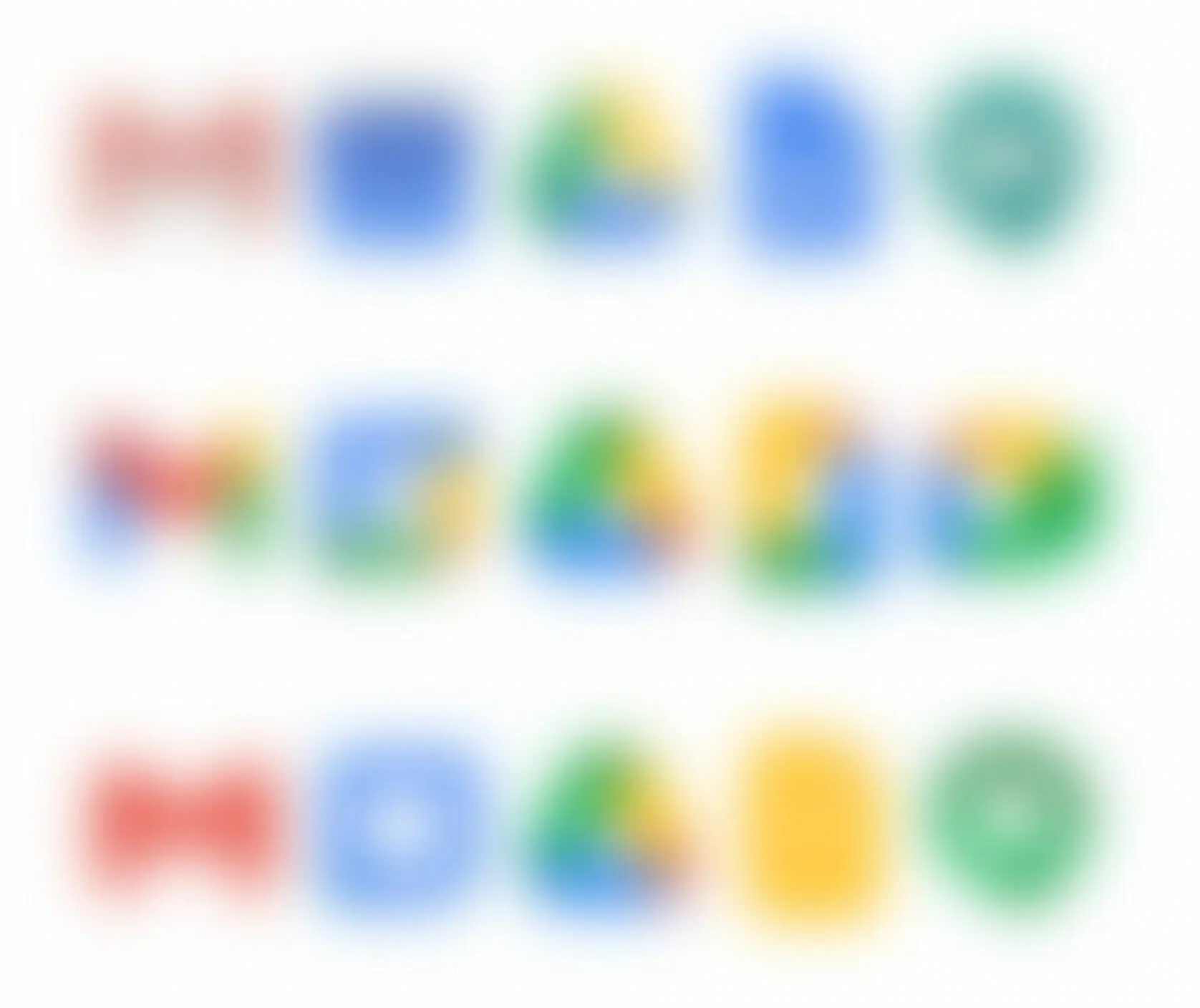
Final Verdict on Google’s New Logos of 2020
Concept and execution are two different things that need to come together in order to make a cohesive final product. Unfortunately, Google was lacking in one or the other in each logo. They might have to make another update to appease the ridicule. If they’re looking for a solution, they’re very much welcome to use ours.
About Us
DotYeti.com is a graphic design subscription service that provides unlimited design for a flat monthly fee. Companies can choose from three different affordable graphic design packages that fit according to their needs and expect creative quality work with quick and reliable turnovers. Check out our prices now and receive a free consultation and get started on your graphic design projects.

")