What are the most expensive logos created in modern history? Logos are an important part of any company’s branding strategy. It helps people remember your company and can even lead to increased sales. Your logos will end up in packaging and online posts and news reports and so on. However, some brands go above and beyond when it comes to making sure their brand is recognized. We made a list of the most expensive logos ever made. Let’s check out if their strategy worked in their favor:
Scroll down until the end of the list to find out the most expensive logo brand of all time
British Petroleum (BP)
The British Petroleum (BP) logo cost around $210,000,000 to make. Yup—that green and yellow flowery emblem remains as one of the most expensive logos in history. Resembling the Helios, the logo signifies the company’s desire to showcase an environmentally friendly image. They implemented the color psychology of green and yellow’s environmental approach while also shapes that may remind viewers of leaves, solidifying the eco-friendly logo design, to extensive criticism.
Pepsi (Redesign)
Costing around $1,000,000 Pepsi’s well-known logo is recognizable on a global scale because of its rivalry with Coca-Cola for supremacy in the market for sweet carbonated beverages. This backdrop Pepsi paid for wanted to maintain its original colors while modifying its brand to the current flat design trend. As a result, the red hue is more noticeable in the new Pepsi Logo.
The main goal of this logo redesign was to bring the Pepsi brand up to date with design trends, compete with Coca-Cola, and expand its global visibility. While they currently haven’t been able to beat Coca-Cola, the redesign was a great success from a design standpoint.
London 2012 Olympics
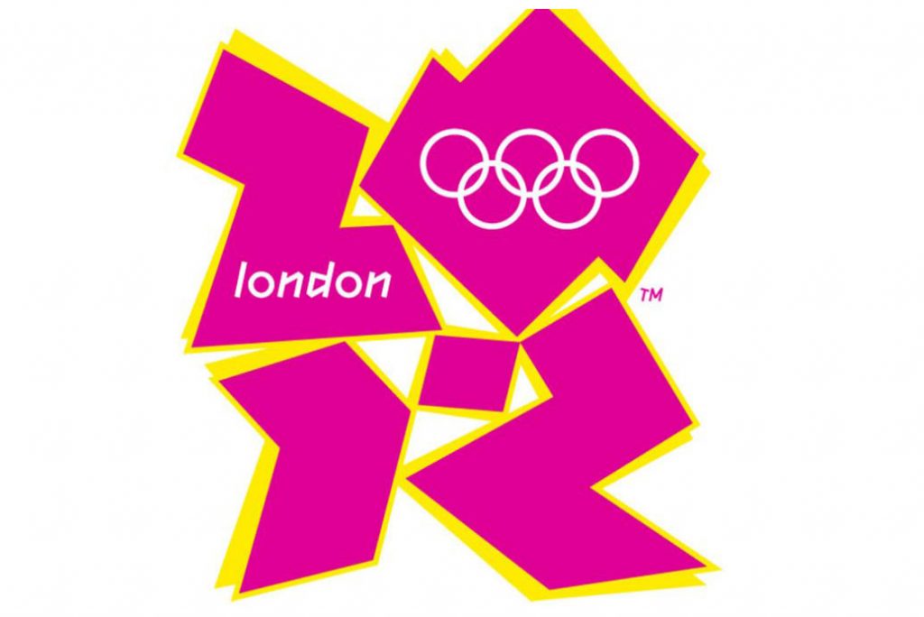
We placed the London 2012 Olympics on this—which costs them $625,000—considering it’s a one-time logo use for such a large sum. Designed by Wolff Olins in 2007, this logo was used for both the 2012 Summer Olympics and the Paralympics in London. The logo utilized a cubism art style using angular squares styled in a manner, that many were not fond of due to a lack of reminiscence to cultural or historical symbols and art.
BBC Logo (Redesign)
It’s safe to assume that English-speaking people all around the world are familiar with the British Broadcasting Company’s famous logo. Even though this logo was a success, the BBC modified its look once more in 2021, spending “tens of thousands” on a revamp. Although the precise cost of the business’s straightforward block-based logo is unclear, estimates place it around $1,800,000. The updated design, which replaces the black box backdrop with a deep grey one and just slightly modifies the lettering, has generated considerable debate. Numerous clients have complained that the business shouldn’t have spent so much money on a design that is so identical to the preceding picture. The BBC, however, remains adamant about its decision.
Accenture
The nine-digit sum of $100,000,000 was paid for the logo, which included the organization’s name, as well as its characteristics and the numerical picture at the top. The main idea was that the company is constantly working toward the future, for growth and improvement. Despite criticism directed at the logotype as well, the firm is currently successfully operating in the market and has built a solid enough reputation for its brand.
Accenture’s logo design was somewhat modified. Rotis Sans Serif Extra Bold 75 is the current standard typeface and the words “high performance” are underlined next to the lowercase version of the company name (Accenture) and the word “Delivered” and a greater-than symbol above the letter “t.”
City of Melbourne Logo
Melbourne’s official emblem has gradually grown to be recognized worldwide. It is meant to symbolize the corporate strength, vibrant, and cool metropolis that Melbourne is today because of its crisp lines and combination of the colors green and blue. Additionally, it won’t change in the future either. The logo was created in 2009 by the Landor Associates Sydney office. The City of Melbourne provided $148,000 for this outstanding effort. The logo’s design is appealing and depicts Melbourne as a fashionable, affluent city that is adjusting to the modern world. The logo is very wonderful and lively. This logo received rave reviews from everyone.
Symantec
And the most expensive logo goes to Symantec—costing a whopping amount of $1,280,000,000. A spot for the logo of a major tech company may seem like an odd choice for this list. But as designer Paul Rand once said, “Good design is good business.” And Symantec’s logo is not only good design; it’s great business. The company’s original name was “Symantec Anti-Virus.” While this name was so generic that it could have applied to any software company making anti-virus protection, its founder knew he wanted to be more than just another antivirus software maker.
Rand’s answer was simple: create something unique that would make people remember your brand over others. Rand had already done some significant work with IBM at this point and had developed a reputation as one of America’s most famous designers—so much so that when Steve Jobs later approached him about designing fonts for Apple computers (which he did), Jobs told Rand upfront how much money he would pay him per character ($100). This made Rand hesitant at first but ultimately agreed because he believed in Jobs’ vision for Apple products overall and felt they’d be worth the investment—and they were!
Branding is expensive, very expensive.
Branding is an important part of any business—and it can be extremely costly. It’s not just about the logo, but it’s also about how your company presents itself and what type of image you want to portray. Your brand will be used for different marketing purposes and can even affect the value of your product or service. For example, if you are selling high-end luxury products then having a refined look will help with sales in that case. If on the other hand, you have a fast-food restaurant then something more casual and fun might be more appropriate for branding purposes.
The cost of building a brand depends on many factors including what industry you are in, where your business operates from (which country), how big your market share is compared to competitors etc. The most expensive logos tend to belong to companies with large budgets who can afford top designers/artists working full time on their project day after day until they come up with something unique enough that will last forever (or until new management takes over).
There are a lot of things in life that can be expensive. Cars, houses, electronic devices, and so on. What we have found is that branding is one of the most expensive things out there. The brands that have been created over the years have become so successful because they knew how to spend their money wisely and get the results they wanted from their investment.
Looking to create your next top-notch logo? It doesn’t have to be this expensive! Make your design visions come true. Book a consultation with us so you can get started with your company logo. Click here to check out our package prices.