Wise may have just launched the best rebrand of the year. In a time when pressures are ramping up to stay competitive in a tight industry, the legacy brand is proving it’s here to stay.
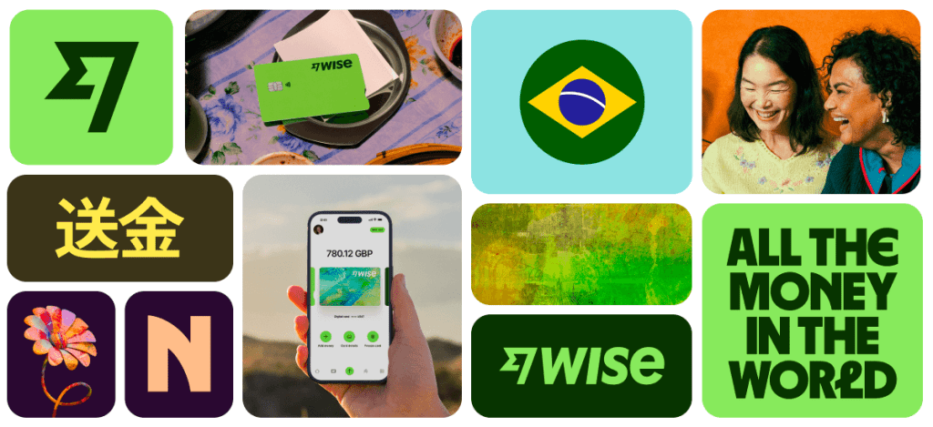
Their new brand position puts them in an ideal place to make an impact. Plus, it allows them to stay competitive with other regional and local competitors while capturing a younger market. Aside from a new look, it also debuts the Wise business card and a money transfer link feature.
If you haven’t heard about the Wise rebrand yet, they’ve recently launched a site. You can find more about their stunning new visual identity at their website here.
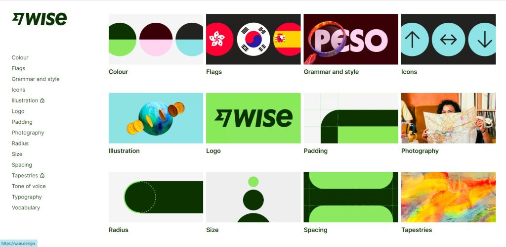
The new visual identity
The new Wise is all about accessibility. That means having a flexible color story, bold and readable text, and an easily understandable visual hierarchy. But most of all, they are moving toward a more global brand position. Here’s how they made it happen.
Typography
The new Wise uses three main typefaces. One is the reliable Inter used from everything to headings and general copy. It’s the go-to typeface for general text: sturdy, straightforward, and accessible.
Meanwhile, Their custom display font Wise Sans is the chosen weapon for bold headlines. It’s a familiar look that is standard of Wise branding. Finally, the company also released standout international glyphs, a sans typeface with round and bold details. It can be used to display different language characters–a perfect complement to the global brand position.
Color palette
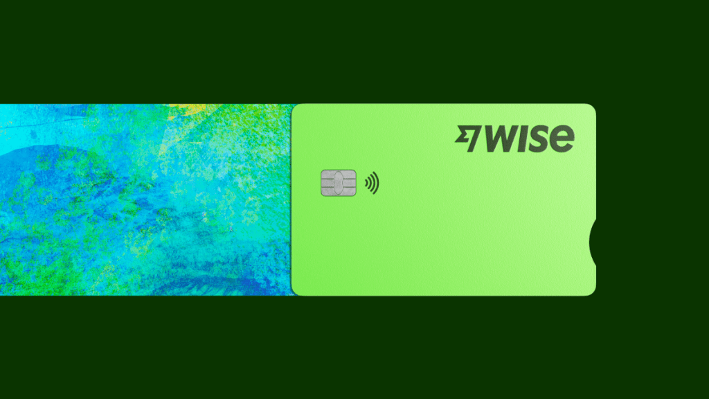
Wise is going green. The new Wise is bright and white–their color palette uses a mix of bright and dark colors to make it friendly for digital screens and physical displays.
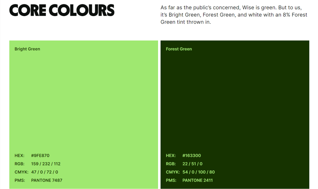
Their core colors are Bright Green (HEX: #9FE870 and RGB: 159/232/112) and Forest Green (HEX: #163300 and RGB: 22/51/0).
Meanwhile, their secondary color palettes consist of a bright orange, yellow, blue, pink, as well as dark complementaries, namely, purple, gold, charcoal, and maroon. The bright hues reflect the youthful and global vibrance of the brand.
Furthermore, they have minimal content colors. It’s a mix of neutral grays with a hint of dark green when needed. The signature bright green is used as an interactive accent. Finally, the visual look makes a lot of use of white space. Here’s a sample of their content rules.
This variety of colors and type all come together to help Wise leverage its tapestry designs. Here, they can pay homage to their globalized branding–including cultural symbols and imagery that are distinct and recognizable.
Overall, it’s a fresh update that ticks all the boxes of a successful rebranding.
Read more: The Ultimate Guide To A Successful Rebranding in 2023
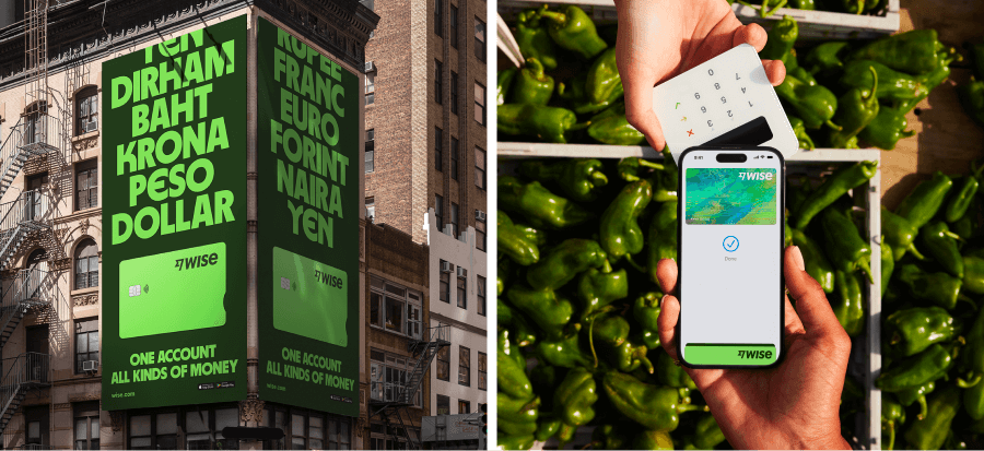
A global brand position
The company started repositioning itself as a global banking service provider first in 2021 when it rebranded to Wise. Currently, it’s one of the leading cross-border payment services in the industry and caters to 50 currencies.
In a statement, the company said the rebrand “draws from global currencies, languages, alphabets and places around the world.”
This new brand position is reflected in their youthful and interactive content marketing. Their social media posts are awash with a mix of blog and image content–all tailored to engage with their audience.
These include travel tips, a list of the best places to live, and foods from around the world. It’s a great way to position itself as a global financial leader, while also drawing some engagement from its audience.
New features
Apart from the rebrand, Wise also came out with new features for US customers. The first is the Wise Business card, a physical card that US users can avail of. The second feature is a transfer money link–users can simply send a link to request payments to speed up transactions.
Along with its rebrand announcement, Wise also breached 16 million users.
Wise was founded in 2011 by Kristo Käärmann and Taavet Hinriku. It started as a solution curb expensive bank transfers across countries. Today, Wise has grown into a global money firm that processes 9 billion pounds worth of transactions every month.
Read more: Behind the Nokia Rebrand: Explained
Visit DotYeti for more creative brain food. We provide reliable marketing insights on digital design, and more.
DotYeti provides the fastest and most cost-effective alternative to agencies and freelancers by providing quick turnaround times, no limit revisions, and a comprehensive range of services. Get to know our scalable unlimited graphic design model today.
Share your story with us so we can create a customized plan for you.