
Want to promote your newest cafe or small restaurant business? These flyer design ideas can help get the ball rolling.
Some people may say that you should focus all your energies on promoting yourself on digital marketing. But, we disagree with that, kind of.
While social media strategy and online awareness are important, don’t underestimate the power of the humble flyer.
Yes, those things you see being handed out on the street, attached to your online order, and in the mail—they can help you get leads!
The key? To have an eye-catching design that would make your food irresistible to customers! So, without further ado, here are 7 flyer design ideas for your small restaurant business.
1. Make it look scrumptious
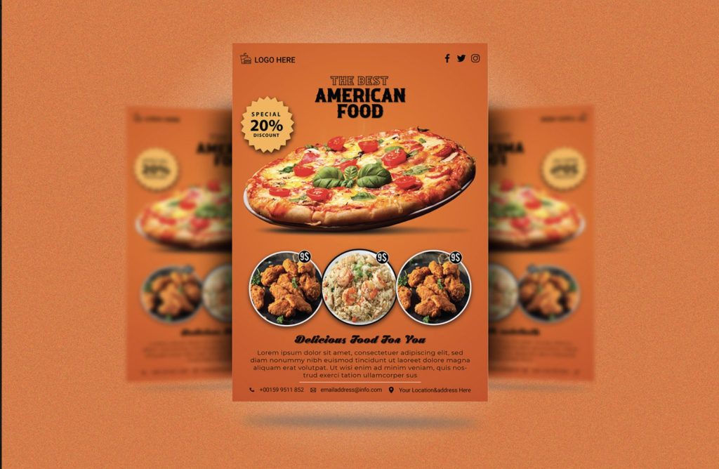
You know what they say about the color red—it satiates the appetite. This flyer design template has a bold red background with minimal pictures of their products to keep you focused on the food.
We like that there’s a hero picture at the center to really get your attention. The supplementary images below give additional information without throwing the layout of the whole flyer out of balance.
All in all, this is a good template to follow when you’re introducing your brand.
2. Do things outside of the box
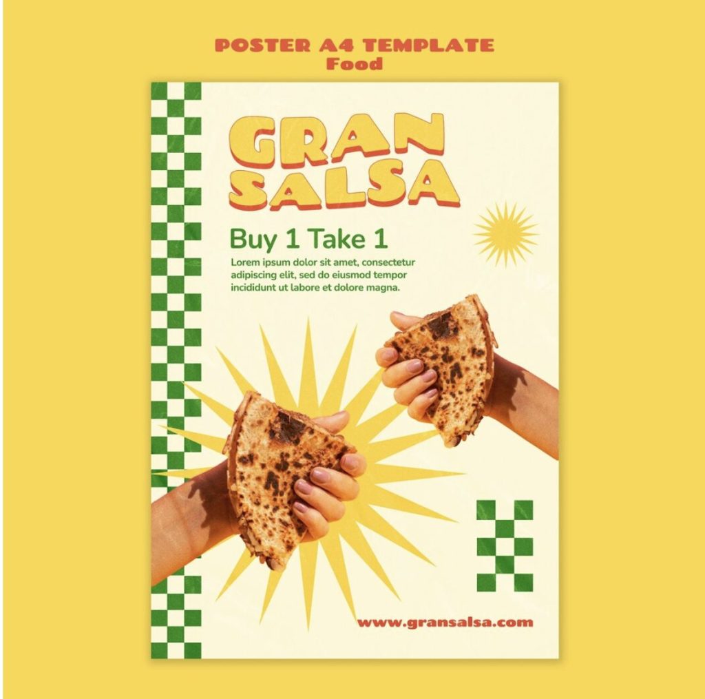
Whether it’s a pop or color, a striking geographical element, or a bold expressive font—there are countless ways you can spice up your restaurant flyer design.
We wanted to highlight this flyer design because of its geometric and abstract elements that are rarely seen in physical flyer design.
In this case, the brand identity of the restaurant shines just as much as their product.
3. Keep it short and sweet
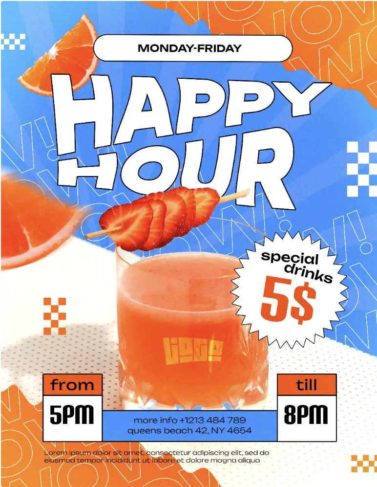
The best flyers are those with short and sweet messages. Just take a look at this bar promotional flyer for Happy Hour.
It’s a no-frills flyer design where the most important information (the event, the timeline, the price, the location, etc.) is all displayed in various font sizes according to importance.
4. The importance of text hierarchy
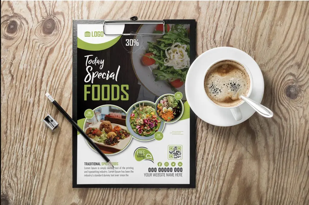
Speaking of degrees of importance, here’s another flyer that masters the importance of text hierarchy well. The most pertinent information is in bigger or more dressy fonts, while less important details, such as descriptions of the food, are in smaller, body text.
If you’re looking to promote certain products for a limited time, we recommend using this template.
5. Experiment with the layout
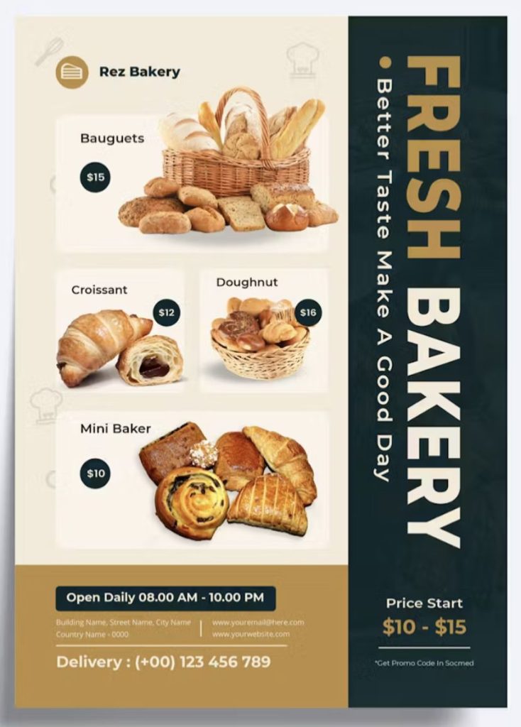
Finally, feel free to look at different ways of presenting your information. Running a new bakery or a small cafe? You might want to give your customers a chance to get to know the items you’re selling.
In that case, this flyer template is a great example of getting the best use out of a limited space.
And there you have it! Five flyer design ideas that small food businesses can use for their next printed flyers.
DotYeti as Your Partner In Flyer Graphic Design
DotYeti is available for your flyer design needs. We’ve worked with F&B brands to craft their menus, social media content, and other graphic design needs.
Want to pair your awesome brand message with striking visual excellence? Check out DotYeti’s scalable graphic design plans.
No matter what kind of flyer design you need, their creative teams can whip up something unique and exciting just for you. Book a demo and transform your small restaurant or cafe business today!


![[Twitter] Must Know Social Media Advertising Facts in 2024](https://www.dotyeti.com/wp-content/uploads/2018/10/DY-Blog-Banner-batch-2_19-scaled.jpg)
![[Facebook] Must Know Social Media Advertising Facts in 2024](https://www.dotyeti.com/wp-content/uploads/2018/10/DY-Blog-Banner-batch-2_20-scaled.jpg)
")