
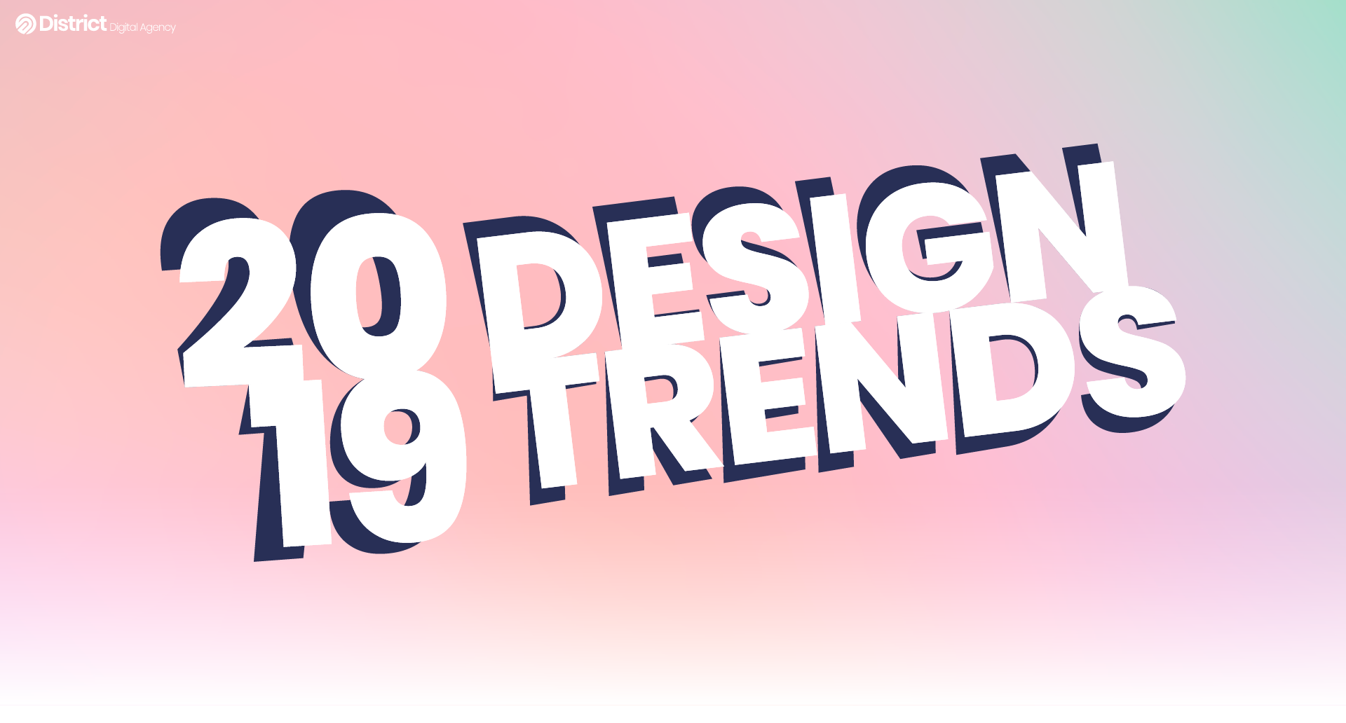
As New Year just passed and 2019 is finally here, there’s been so much that happened in the past 12 months. It makes you wonder what graphic design has ahead for us this year. It’s time to get excited about all the colors, shapes, and styles that are going to define the year. Last year, we made a fun forecast for 2018’s graphic design trends. It was an adventure of vibrant colors and a back-to-basics road with handmade typography.
Read on to find out if we’re about to have a huge turnaround from last year’s gradient and colorful adventure or if it’s going to further develop in that direction.
1 / Holographics
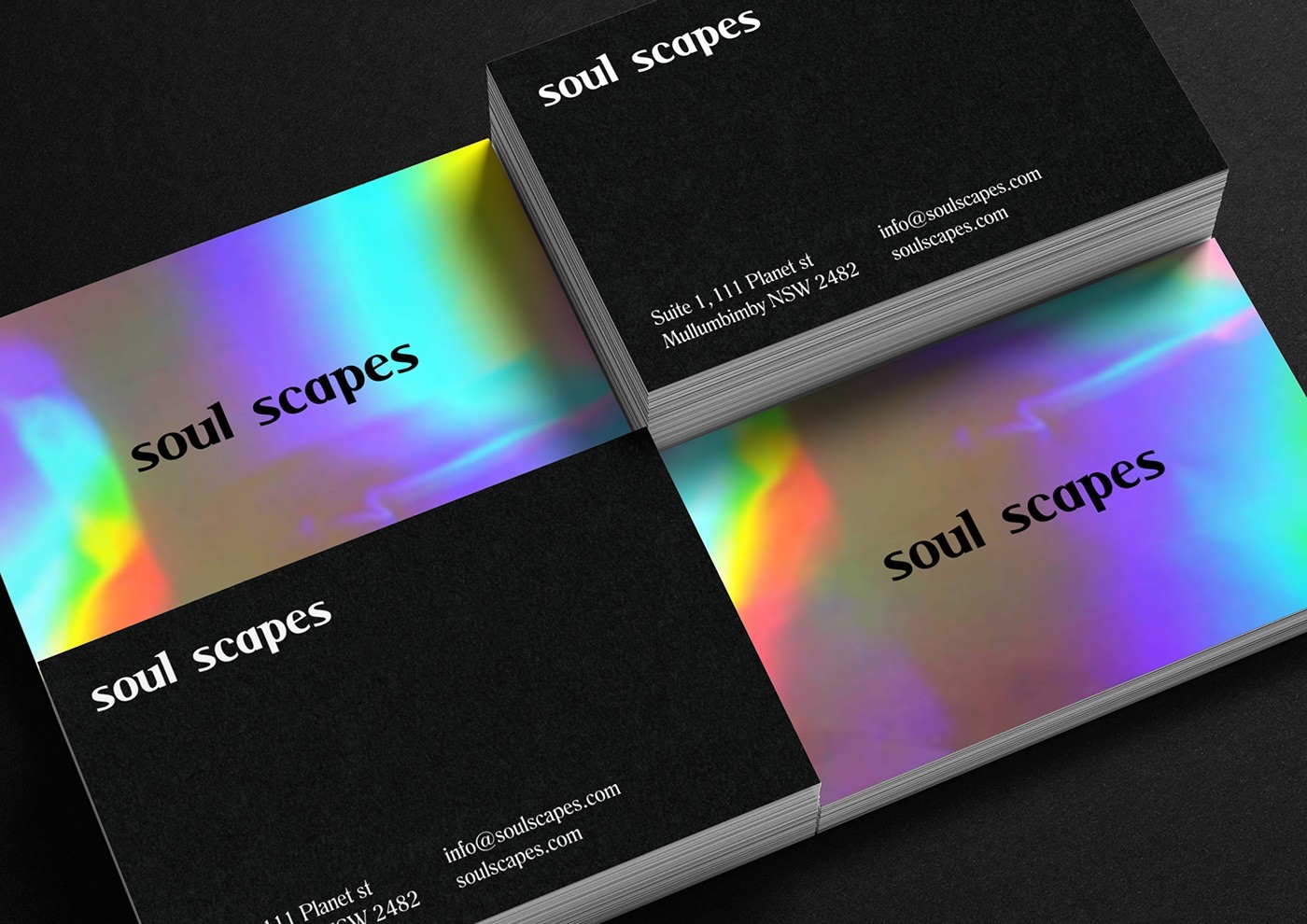
source: https://www.behance.net/gallery/62221669/Soul-Scapes-Branding
You can go for a more classic look like these calling cards for soul scapes which make use of one side with the holographic design to capture attention.
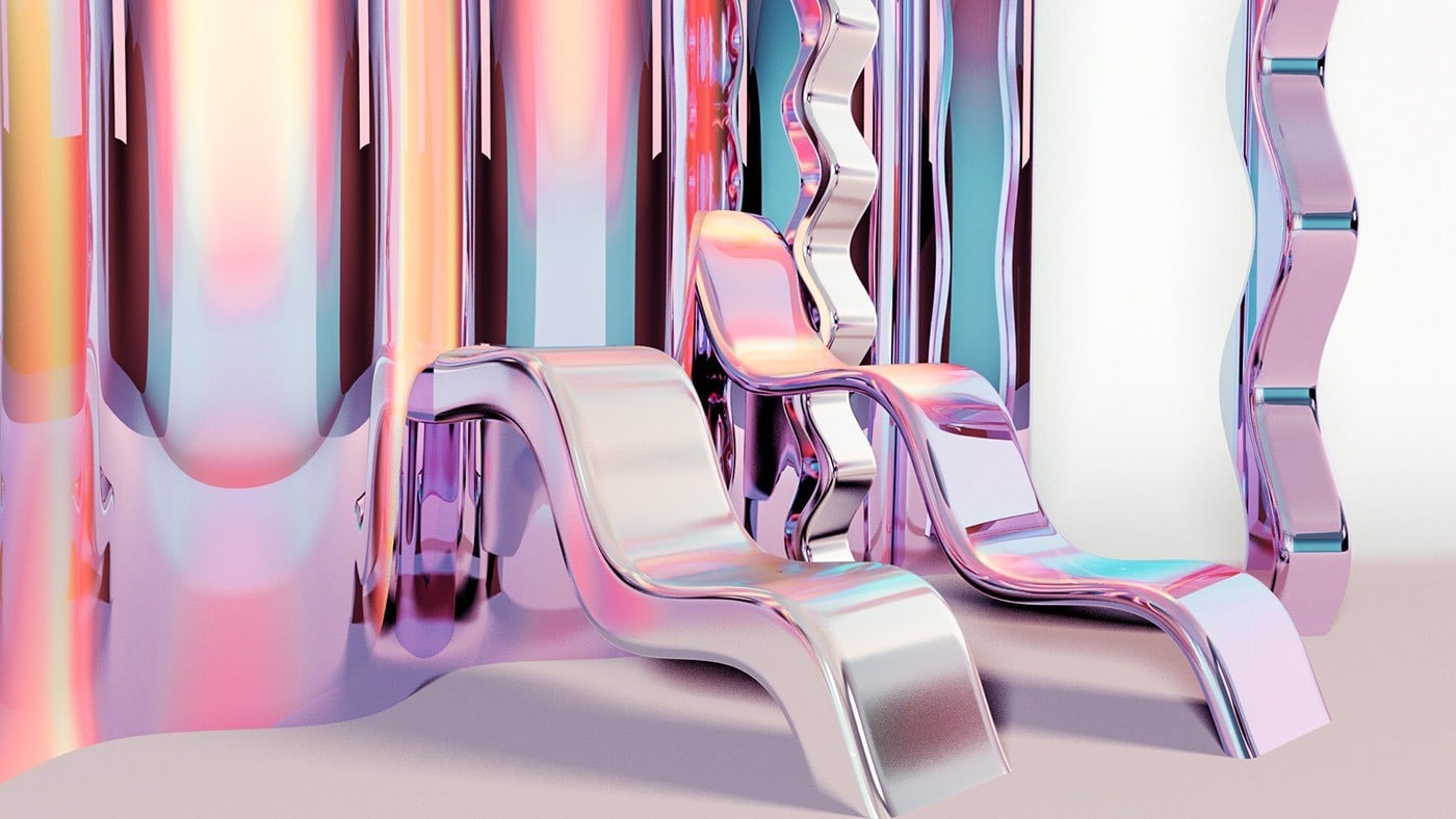
holographic. source: https://www.behance.net/gallery/40282521/Iridescent
Meanwhile, you can go all out with textures and depth like this holographic set from Fran Serrano. This takes the holographic trend to a whole other level with the effect going three-dimensional.
2 / Adventurous Compositions
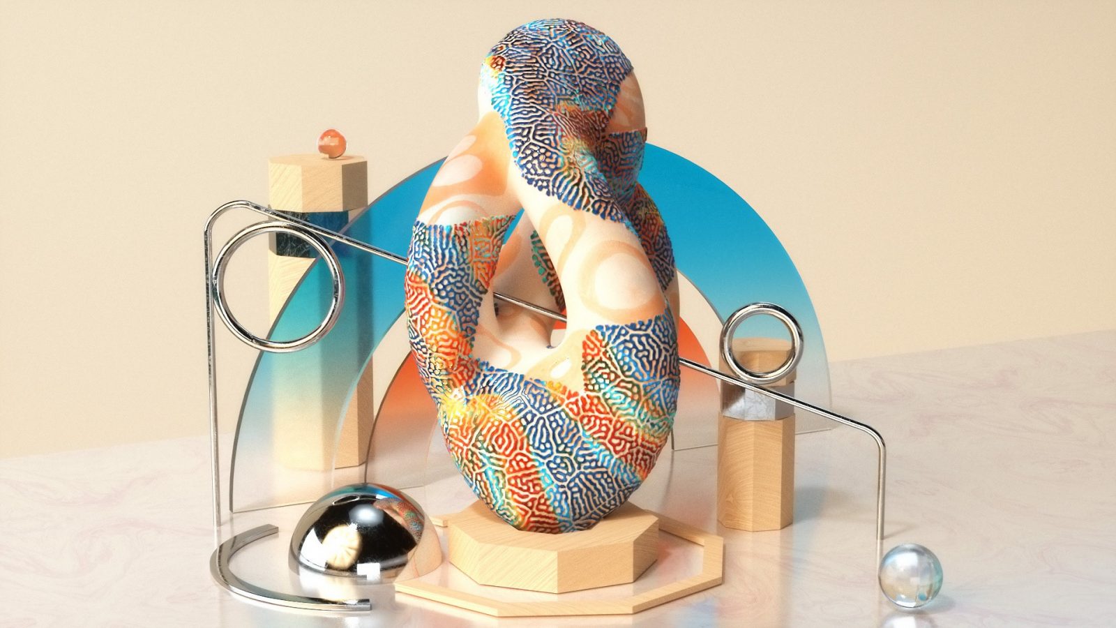
composition. source: https://www.behance.net/gallery/73618863/CHROMATOPHOR
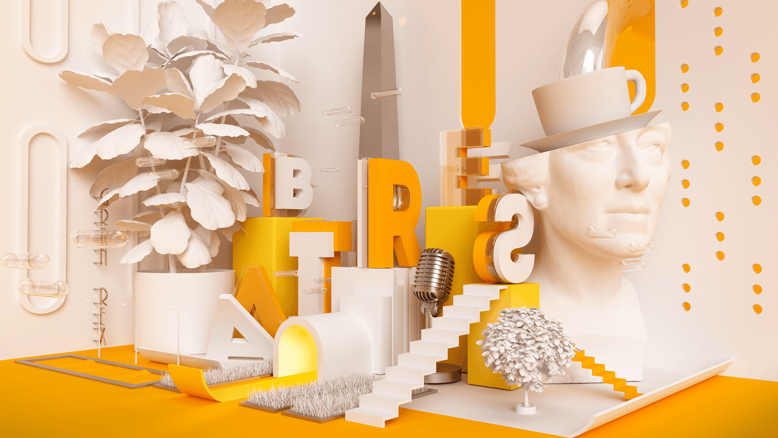
source: https://www.behance.net/gallery/51867931/BAIRES
Meanwhile, we have this truly over-the-top composition from Luis Lopez that even integrates typography into the mix. It creates a very whimsical and interesting piece that keeps you looking for elements and textures that blend wonderfully.
3 / Bold Fonts
As every trend grows bigger and bolder, so do the fonts that come with it. It’s been around for a few years now and the best combination is a big font is creating a minimalist design. This is able to create an eye-catching combination that won’t look overcrowded and too much of everything.
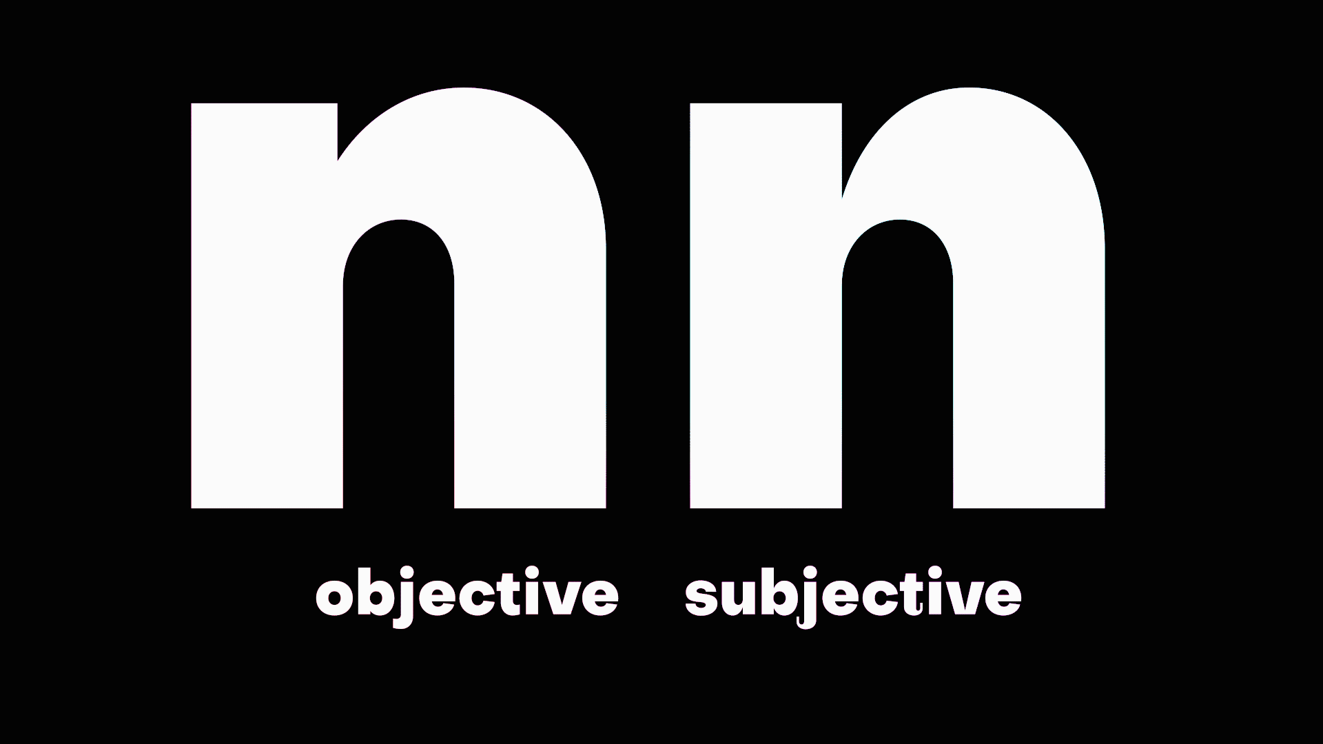
Subjectivity Font
The Subjectivity font gives you 2 options creating a very different vibe for each one. The serif creates a more whimsical but formal type while the normal one giving a simple but bold statement.

Walrus Font
At the same time, we have the Walrus font which is just unapologetically bold in its essence. There are many bold font variations you can play with to give you the feel you want for whatever message you want to convey.
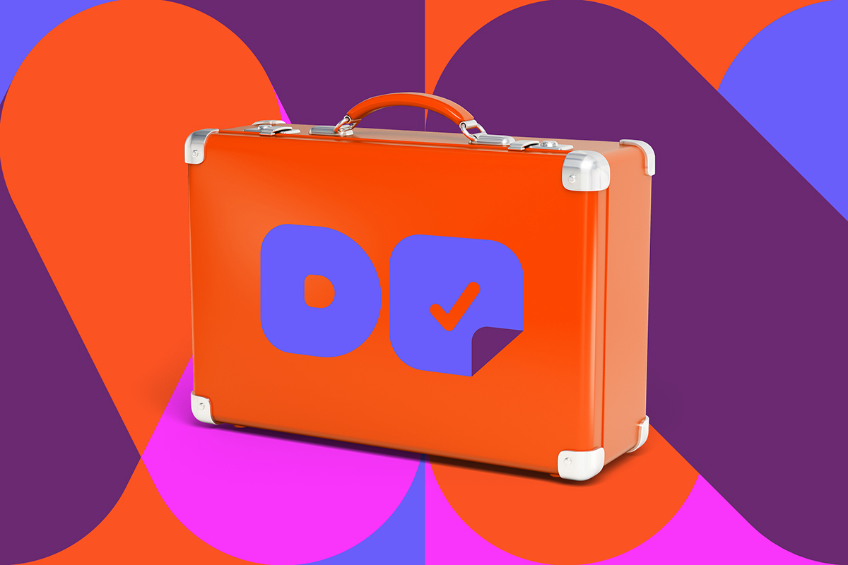
4 / Core Branding
A trend we also saw last year was a stripped-down type of branding. It’s simple lines, basic colors, and clean fonts. These are enough to create a good brand definition. While the designs for press materials and the like could be over the top and colorful, branding goes the opposite route. Gone are the days of complex logos with as much design compacted in it as contemporary branding is minimal.
Subtraction has created a unique and easy-to-understand way of a memorable brand identity. This creates a clear and quick image of your brand’s core to the customers.
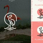
The logo for ‘Flamingo’ is nice to look at and creates a simple and quick image with the flamingo outline extending from the word. It’s also important to choose fonts that are unique but easy to read.
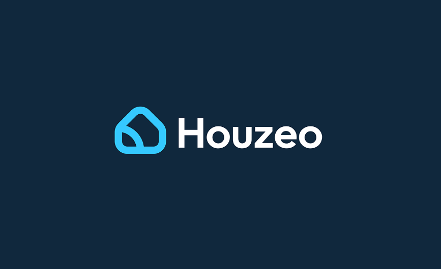
Houzeo’s logo is straight to the point wherein you quickly know that their product or service is something related to houses. At the same time, it’s modern with the way the house is geometric and simple.
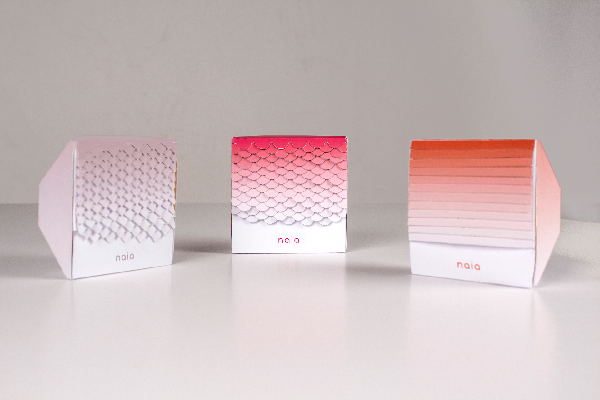
5 / Gradient Packaging

gradient packaging
This packaging creates a very modern feel with the trendiest colors in the past year that create a gradient that’s nice to the eyes. It also doesn’t take away from the information and you still get all that you need to know about the product.
trend
Meanwhile we have this prototype from Naia that makes use of a single color gradient but adds texture to make it more unique. It also creates a more artistic feel that makes it look more luxurious. You can check out our article on how art affects luxury products here.
6 / Retro

trend
This piece by Aaron Campbell immediately takes you back to a neon, hairspray dream. Whether you were a kid then or weren’t even born yet, it’s easy to fall for this style as it feels nostalgic but somehow futuristic at the same time.
Donna Retro Art
Justin Bechard creates a fusion of modern and retro in his advertisement for an app named ‘Donna’. While the colors and shapes are very retro, the three-dimensional style gives it an updated feel creating something that’s new but retro at the same time.
Hope that you found these trends useful for your brand in 2019! If you want to find out more about the trends or you need help incorporating them into your own brand, worry no more because we’ve got you covered. With our unlimited graphic design services, DotYeti can help you in branding your business. Sign up today to get started for as low as $449 a month!

")