If you want to get into your audience’s head, one of the best ways to achieve this is by looking for the best logo designer in the business.
‘Developing a Creative Eye for Graphic Design’ is a blog series that shares first-hand knowledge and experiences from DotYeti’s creative team. This time, we’re diving into the cherry on top of all branding strategies: the logo. Our Creative Yeti, Roi will share his tips and tricks on how to make the perfect logo design.
Often called ‘Roi Q’ so as not to confuse with our CEO Roy, Roi is heralded as DotYeti’s best and most talented logo designer. For the most part, he’s self-taught when it comes to logo design.
Logo designing has always been Roi’s go-to ever since he learned graphic design. Due to his impressive portfolio from previous clients, he was immediately DotYeti’s top designer whenever we received logo requests. But how did he start off, you ask?
“I got hooked during my first few employment years when I found making static designs on a daily basis stale and tedious,” said Roi. “Now, I’m more of a Logomark than a Wordmark logo designer. I love making symbols that look nice and clever.”
There’s a whole world out there of logos, and a logo in itself has a world of meaning in it. But before we dive deeper, what are logos anyway?
What is a Logo?
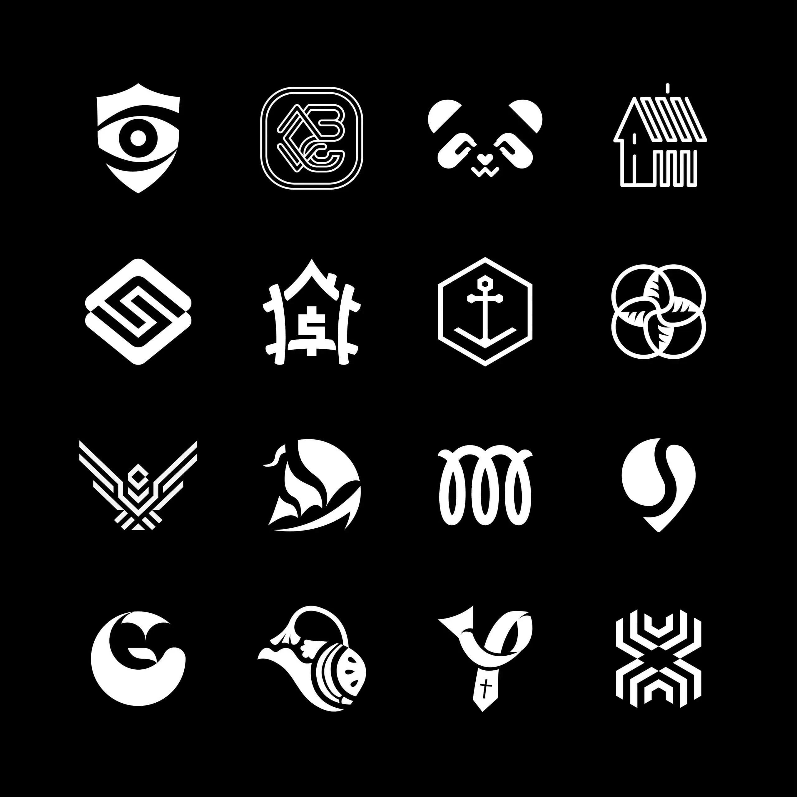
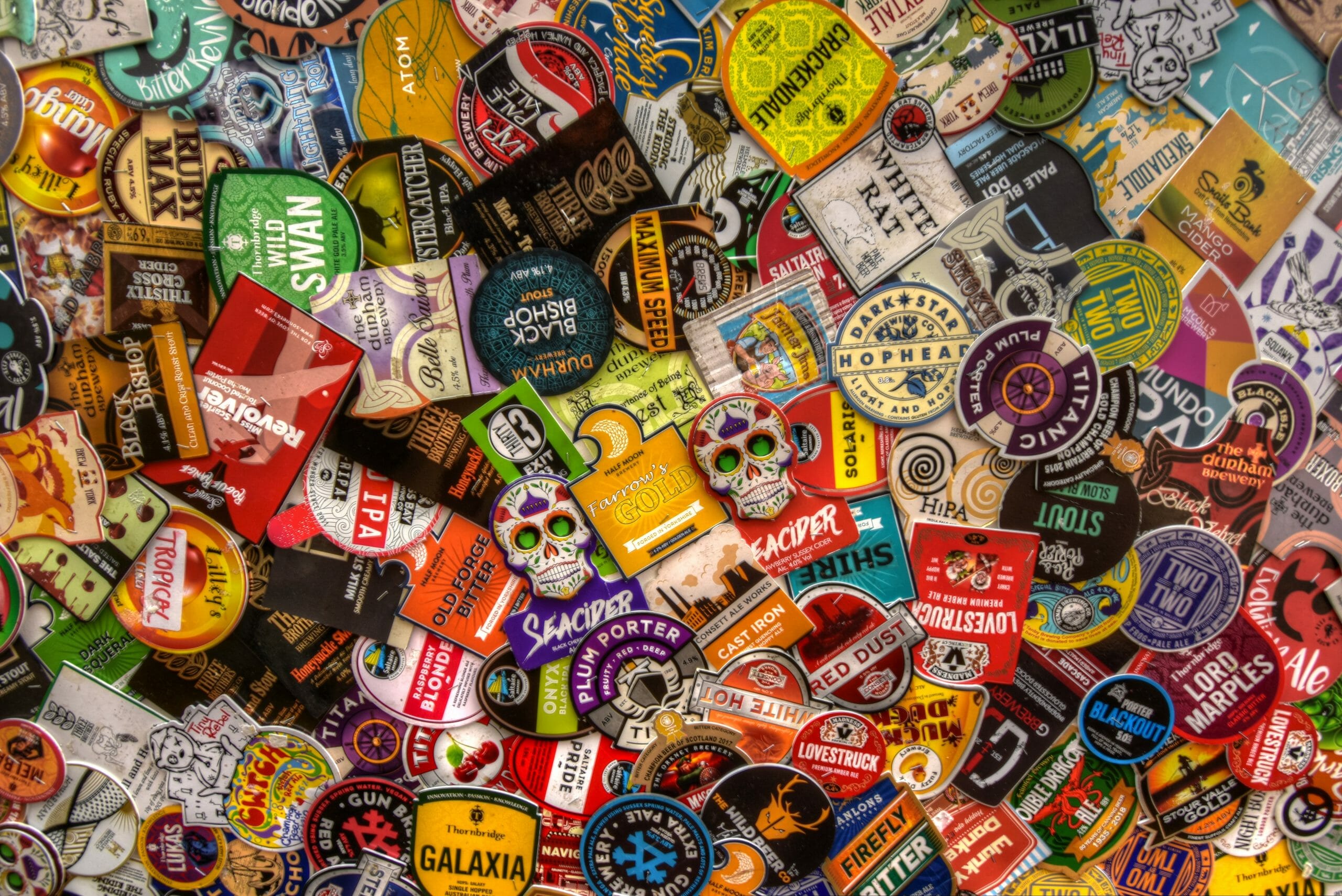
Roi’s Work
Logos are symbols used by companies to identify their products. Over time, it came to represent company values and identity as well.
Formerly known as logograms or logotypes, it originated from the Greek word logos meaning word, thought, principle, or speech. It circled back to the shortened term “logo” around the 1930s.
Logos are an amalgamation of various design elements that already have their own meanings. These orchestrated combinations appeal to our psyche to generate a specific message or idea without having to read the whole company’s bio.

7 Essential Skills You Need As A Logo Designer
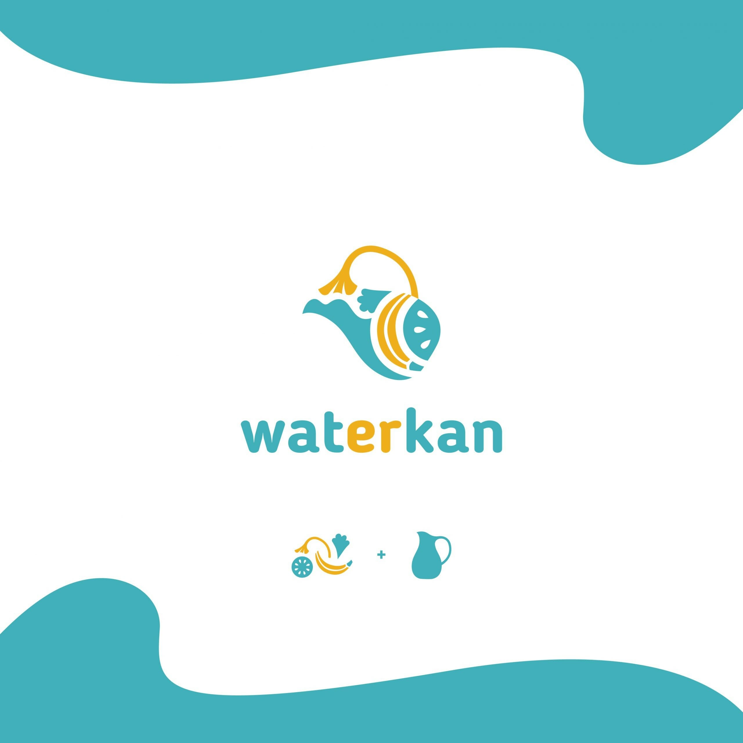
Roi’s Work
Great logos should effortlessly convey to the audience why they should buy what the company is promoting; it should almost immediately prove to your customers that your brand and the products you sell are the best in the market.
Creating a logo bears a lot of responsibility—which is why your logo designer should have all the required skills in order to make an effective logo. Here are Roi’s tips on the skills you need to be a logo designer:
1. Communicating ideas
“Every designer is a communicator but some get lost in the process. If they make the logo too personal, some elements might be understood by only the designer. Defeating the purpose of making consumers get ‘the big idea.’” said Roi.
At first glance, people should get the gist of your brand identity—especially if it’s a new company. Logos evolve over time, and that’s usually when they shed layers until it becomes simple and iconic, but being iconic isn’t your first priority. You know your company inside out, now it’s time to illustrate it.
2. Illustration
Although it’s not always necessary since some logos only consist of the brand name itself. It’s a handy skill to have if you want to use a solitary symbol as your logo—or even just to add flair to your letterform.
The challenge lies in coming up with something original. Say for example that your company name is “Bullseye”, can you design a logo that wouldn’t resemble Target’s logo? Don’t be another Viber & Whatsapp situation and hone your skill in illustration.
3. Color theory
Putting meaning and associating emotions with colors has been a human habit for centuries. And honestly, the history behind colors and the way they got their meanings is achingly interesting; like that of Tyrian purple and ultramarine.
But history aside, there’s a reason why banks often stick with shades of blue and health products stick with green—though you subconsciously know the answer already. Blue signifies safety and security while green represents nutrition and wellness. Playing around with different shades and tints could add a whole new layer of meaning to the colors you pick, so pick wisely.
4. Typography
The font style used on your logo is just as meaningful as what it’s saying. There’s a psychology behind typography that, just like with colors, has been ingrained into us over or because of time.
Serif fonts imply sophistication while sans serif fonts imply modernity, with a big thanks to the Bauhaus. Serif fonts can also signify olden ages and sans serifs can signify simplicity. Overall, the typeface is a major ingredient in the meaning your logo will evoke.
5. An understanding of symbolism
Symbols evolve overtime—all the time. But once their meaning has been tainted or worse, associated with tragedy, it’s better not to try and give them a comeback through your company.
“Designing logos is kind of like tiptoeing over broken glass. You may think you came up with something original but instead, be faced with a plagiarism lawsuit or be accused of misusing an ancient cultural symbol,” said Roi.
Reading up and having some knowledge on symbology can be useful to avoid unpleasant situations. For example, check out these different crosses and their meanings; just in case your logo involves a varying cross symbol.
6. Analytical skills
“First impressions last,” said Roi. “So I note down feelings and impressions I had when I first saw a logo to avoid long-exposure bias. After all, logos are meant to be seen not more than 3 seconds in any printed or digital medium.”
“Then I look for the concept behind the logo and gauge how creative the idea is. Then the execution, how clean and how well thought of are the shapes, colors, lines, sizes, and spacings. ”
7. Software skills
Adobe Illustrator is the top software that can bring your logo to life. In fact, there are options and tools there that you didn’t know existed that could potentially improve your logo.
“Start with Illustrator,” said Roi when asked about the easiest software to learn. “There are vector-based software that is also good such as Corel and Affinity, but if you’re doing logos as a professional and not just for hobby, do it in Illustrator.”
“DON’T USE PHOTOSHOP, PEOPLE. That goes for me as well. I mainly use Adobe Illustrator and I need to master Illustrator sometime soon,” said Roi. Using Photoshop is inadvisable because of formatting. Having a raster format logo means it could end up looking pixelated.

Honing Your Skills in Logo Designing
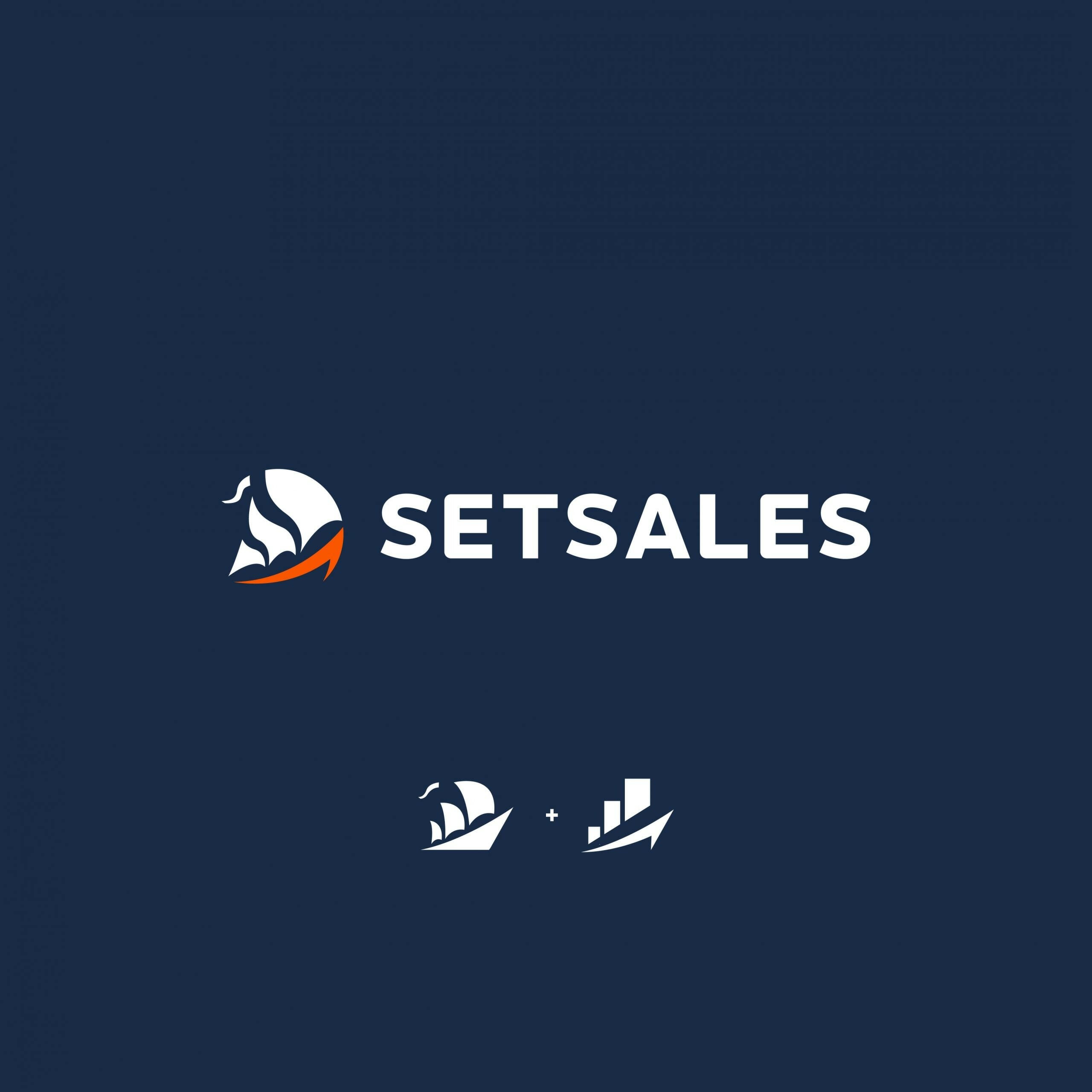
Roi’s Work
1. Less is more
Don’t overdo it and keep it simple. As a passionate entrepreneur, you’ll want your logo to embody every aspect of who your business is.
This can lead to you adding so many smaller symbols into the mix and unless it works well like in Unilever’s case, it can also end up looking like an incohesive coat of arms or a jumbled mess.
2. Conceptualize more
“A logo designer has to have a creative mind, eye, and hands,” said Roi. Perceptiveness, authenticity, and illustration skills are the trinity of logo design.
“I personally think of logo design as 50% Conceptualization and 50% Execution,” said Roi. “So you have to be good at both worlds. Aesthetically pleasing design backed with an awesome concept and thought.”
3. Ask both illustrators and non-illustrators for input
“Show your work to other designers with ‘good eyes,’” said Roi. “We tend to acquire design bias when we look or work on our designs in longer periods of time. You can show it to other fresh eyes or you can leave it for the night then look at it again in the morning, just so you know how good it matured overnight.”
Also, non-designers will be the ones who’ll see your logo daily so it’s best to ask them for their collective opinion. Sometimes, your design knowledge can get in the way of communicating with consumers. Appealing to their subconscious is one thing, but publishing something they won’t or don’t understand is different.
4. Make different illustrations of the same thing
Just like our advice to illustrators, it’s best to widen your visual library. There are common items used as symbols like wings, lightning, trees, etc.
If you think there’s no way for you to make an original illustration of that, think again. Look at bird species or local or foreign trees. There’s always something you can do differently and artists you can pay homage to.

5. Observe current media for trends
“I follow logo design pages on social media and join logo designer groups,” said Roi. As important as individual identity maybe, you have to find a common ground with your audience’s taste. After all, your business is, in a way, for them. Your logo should be something that beckons to them.
Design something that would immediately catch the consumers’ eye or intrigue them. Try to look at the most noticeable logos and draw inspiration from them. It’s important to balance originality with conformity.
6. Self-study and practice
“Some of my favorite YouTube channels are The Futur Academy and Will Paterson for professional logo and branding content,” said Roi. “And Zimri Mayfield’s YGR and Kel Lauren for casual and fun logo redesign videos.”
“I also recommend online course platforms such as Domestika and Skill Share. Those come with a price though, unlike YouTube,” added Roi. “Also, I haven’t bought books so I can’t actually recommend and give my 100% review on any; but I am planning to get my hands on TM: Trademarks and Identify by Chermayeff & Geismar, and Identity by Sagi Haviv.”
5 Types of Logos
1. Letterform
Letterforms, also called monograms, are stylized abbreviations of company names. These work well for enterprises that have long names such as news stations and non-government organizations because they’re easier to remember.
Since acronyms can get lost among multitudes of competitors, it’s up to designers to make these letters distinctive and eye-catching. Think of CNN’s iconic design or WWF’s simple yet unmistakable logo.
2. Wordmark
If name length isn’t a problem, a wordmark may just be what you need. Also referred to as a logotype, this is easily the most digestible type of logo. DotYeti’s logo falls under this category along with Google.
The challenge here is finding a way to get creative with the shape of the letters that pair well with what your company stands for. For others, it’s the font they focus on while for others, they rely on colors to relay their brand identity.
3. Pictorial marks or logomark
Pictorial mark, logomark, brandmark, or even mascot—it has many names. But the essence of it is usually one solitary image that’s enough to identify your company without any words in it.
Common examples are the logos of Nike and Target. If your company can have one image that can define it, Roi thinks you should go for it—if not simply because it’s more fun to play around it.
4. Emblem
Emblems are logos that often give you the feeling that you’re part of a club or community. They are the height of sophistication, as the concept behind them is similar to a coat of arms. They also give off a vintage feel to brands.
Some examples are Harley-Davidson and Starbucks. They are a combination of symbolic imagery and text, with some even indicating the date of their establishment.
5. Combination
Although it was mentioned that emblems are a combination of symbolic imagery and text, it isn’t always the proper term for all logos that have a mix of the two. Emblem logos are combinations, but not all combinations are emblems.
Take Adidas and Puma. They have a logomark along with their stylized company name with it—and it doesn’t look bad at all. Fun fact: their founders were the German Dassler brothers so no wonder they have some similarities.
Unlimited Designs at DotYeti
Need a fresh logo ASAP? At DotYeti, our designers provide meaningful and expertly drafted logos that’ll burn themselves into your customer’s minds—guaranteed. They’re created by talented designers like Roi and reviewed by top-notch art directors.
If you find that hard to believe, take a look at our portfolio and case studies to see how our logos and branding strategies have helped our clients make their businesses stand out.
And the best part? It’s completely affordable. Visit our pricing page now to see which design package is right for you. Too much or too little? Feel free to reach out to a Yeti today to plan out a custom package—just for you.


")