
‘Developing a Creative Eye for Graphic Design’ is a blog series that shares first-hand knowledge and experiences from DotYeti’s creative team.
In our fast-paced world, we’re expected to absorb information in bulk over a short period of time—which is why we love the convenience of infographics. For this blog, our expert in question is Creative Yeti Christian.

Christian is our Branding and Layout Yeti. He studied Multimedia Arts and was a freelancer before joining the company.
“Back in college, I was a layout artist for our school publication and there was a section of our newspaper that needed infographics design. As someone interested in graphic designing, I initiated to do it,” said Christian as he was recounting how it all started.
“When doing infographics, my style most of the time is within the clients’ brand. But when it comes to personal preference, I like the minimalist approach. Clean designs can’t go wrong, and they appeal to me the most.”
Before we jump deeper into the details, the principal question is, what is an infographic?
What is an Infographic?
Christian’s Work
Infographics are charts or diagrams combined with several bodies of text. They’re considered as an ensemble of visualized data. “It should serve its purpose of engaging the reader’s interest instantly,” said Christian.
Coined around the 70s, ‘infographics’ is the combination of words information and graphics. The use of infographics dates back to the era of cavemen wherein imagery has been used to tell a story or relay information.
Nowadays, you can even include animations if you want an infographic that really catches your attention. For a basic start, here are some tips from Christian:
4 Essential Skills You Need As An Infographic Designer
Christian’s Work
1. Research
“Research, research, researchhh… I did intense research on what my infographics were all about and I was never content,” said Christian. The process of creating an infographic is half research and half design. Unless the data has already been prepared beforehand, it’s good to have an arsenal of credible sources.
At any rate, it is highly unethical to share false information and it could get the author in trouble. So as a special treat, here are some data repositories that offer research-oriented information:
- Google Trends Datastore
- The U.S. Government’s Open Data
- Pew Research
- SAGE Journals
- Google Programmable Search Engine (for books)
- Statista
- Scribd
- Google Scholar
2. Storytelling
You’ll be handling an extensive collection of data so it’s important to know the focus or the subject of your infographic. Likewise, having some skill in storytelling ensures that your work doesn’t confuse the audience. Sift through the research and pick out the data that you want to visualize. Afterward, it’ll be easier to create a flow.
One strategy is to divide your gathered information into three parts: the introduction, climax, and conclusion. You can begin by laying out the background information first, then highlight the main data or message in the middle, followed by a conclusion or a call to action.
Another technique is to organize the data on an inverted pyramid. This is typically applied in journalism wherein the most important information is all placed at the top while the following details decrease in importance or urgency.
3. Design Software Literacy
There are tons of websites and design platforms out there that you can use to create an awesome infographic. “Canva is recommendable for beginners as it offers a wide range of free infographic templates,” said Christian. “The only catch from this is that you’ll be extremely limited and forced to work with what’s available.”
Having knowledge and skills with various design software allows you to have full control and creative freedom. You won’t have to feel bad whenever you can’t use a Premium illustration or template because you can do it on your own.

4. Layout and Design
“Creating Infographics is a juggling act,” quips Christian. As a designer, it’s a no-brainer to have a general understanding of the elements and principles of design. Your infographic will undoubtedly look better if you know how to curate your illustrations and text.
If you’re a beginner, the two main elements you have to keep in mind are texture and space. The texture when applied to your background or visualized data makes it stand out and grab a reader’s attention. Having an understanding of positive and negative space, meanwhile, makes sure the infographic isn’t overwhelming.
As for the principles of design, always keep emphasis, movement, and balance in check. Emphasize the important data with clear illustrations. Meanwhile, movement refers to where our eyes lead us based on the design elements that grab our attention first. Through these, you can keep a steady flow and make your infographic easy to read.
“I’m not a fan of Thanos but when doing infographic designs, I apply what he said. ‘Perfectly balanced, as things should be.’ Too much text information can be overwhelming to the audience, the same thing goes if there are too many of the designs—so learn how to balance it,” said Christian while laughing.
“My tip is to make it simple yet catchy. Keep the text to a minimum and let your visual graphics communicate more—it will give an extra impact, trust me!”
Honing Your Skills in Infographic Designing
Christian’s Work
1. Read more, watch more
“Good news! You don’t need a formal education to become a graphic designer,” said Christian. “What you do need is to have a solid understanding & patience and of course creativity.
“YouTube will be your buddy if you are a beginner. Almost everything you want and need to learn about graphic design is there, whether it be a basic or an advanced level of infographics design that you’re interested in. While for inspirations and pegs, Pinterest and Behance are my best friends.”
Consuming informative media during your downtime is a great way to consistently learn. YouTube (especially The Infographics Show channel), Netflix, Curiosity Stream, and other forms of media all contribute to your stock knowledge.
What seems like useless information now will eventually find a purpose in your work. So you see, you’re never actually wasting time as long as you learn something new.
2. Practice making infographics and share your work
“Keep in mind that your top priority is to convey ‘info’ while making sure that your ‘graphics’ is visually appealing,” said Christian. “Identifying your audience and collecting the data will always be the easiest step to start with.
“Once you have it, you can now proceed with conceptualization. That might take up your time but mind you, once you get a solid concept of visualization, the designing phase will be easy-peasy. Then there you go, you are now on the challenging yet fun part—the execution.”
The best way to develop an eye for infographics is to create them from time to time. Choose a topic that you’re passionate about and find a specific focus to share your research findings on. If you’re in a blank state, try looking through international holidays and see which one excites you the most.
3. Illustration and Software Skills
There will come a time wherein PNGs and free illustrations on the internet won’t look right in your infographic. Using illustrations from varying artists will make your infographic look disunited in the worst way. Hence, you might as well develop some skill in illustration if making infographics is something you want to do in the long run.
“Adobe Illustrator is my go-to when it comes to this,” added Christian. “Most infographics nowadays require vector illustrations, and Adobe Illustrator is the top software to use when illustrating.
“I know AI can be overwhelming for beginners but you have to be at least proficient in design software where you’ll create your designs. You can rely on Adobe Photoshop as well, but isn’t the best program for infographics though.”
4. Keep up with design trends
Keeping up with trends is a must for every artist. Not just because it’s what the audience prefers, but because it lets the artist appreciate the current evolution of art. In a way, it’s kind of like participating in history.
“I take advantage of the power of social media. On Facebook, I follow pages, join groups, and watch random stuff that’s related to design in general. From there, I get tons of inspiration and get motivated. This enables me to keep up with infographic design trends.” said Christian.

9 Types of Infographics
Christian’s Work
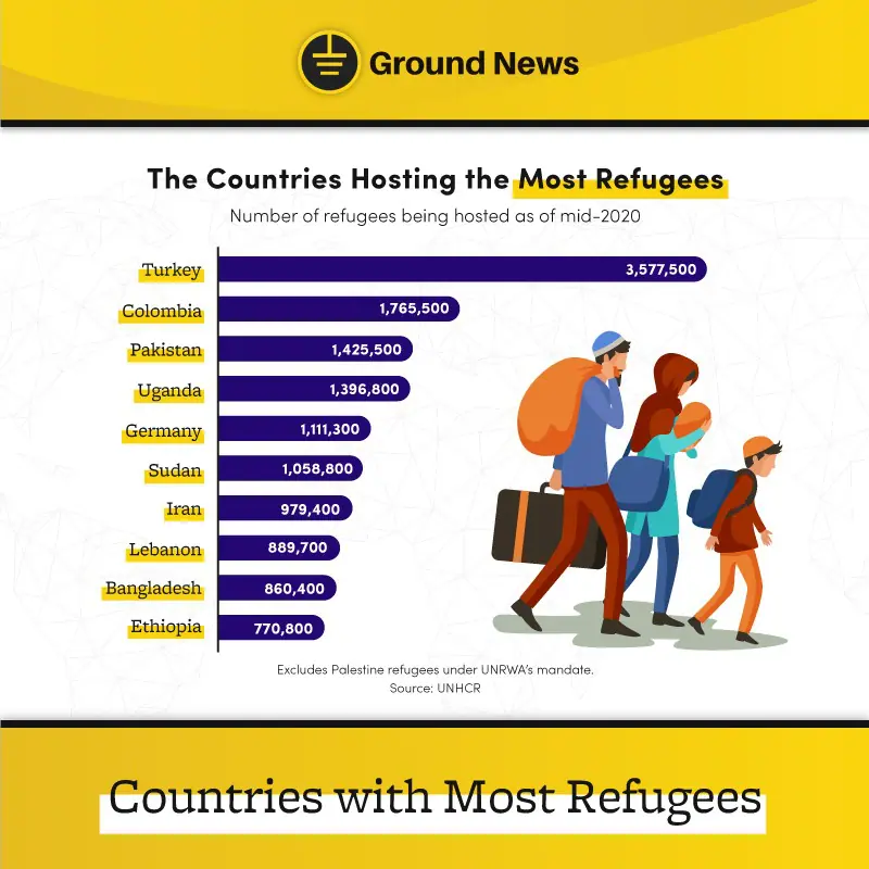
1. Statistical
A statistical infographic simplifies research and survey results by highlighting the important numbers and data. All infographics are generally a hybrid of different types. This type is usually illustrated in percentages, charts, icons, etc. In contrast to the others, it is focused on mathematical information.
2. Informational
People use informational infographics, which are widely spotted on Pinterest, for posts that don’t necessarily involve numbers for emphasis. They’re great for quick tips and repurposing content such as informative videos or blog posts, essays, books, and other full-bodied texts into a summarized infographic.
3. Timeline
On the other hand, timeline infographics take a chronological focus in recounting information. This type is best used for historical topics which share a figure’s journey or life. It is also best suited for observing the progression of a particular person, thing, or event. Through this format, it is much easier to track growth through the measure of time.
4. Process
Similar to informational infographics, process infographics focus on step-by-step instructions in order to effectively direct readers. This is a great way to give visual guides to manuals for administrative processes, recipes, how-to guides, etc.
In fact, people see these in both public and private institutions for a multitude of events. It saves the masses a lot of time and effort in absorbing long instructions and is visible from a distance.
5. Comparison
A comparative infographic is a combination of facts regarding two or more topics or objects—best used to discuss varying specifications as well as pros and cons. Comparison infographics are also an effective type of infographic if your goal is to persuade readers to make a change in their lifestyles or purchases.
Additionally, it doesn’t always have to be competitive. This is also used to cite differences.
6. Geographic
A geographic infographic highlights information about locations and often illustrates a map at the center. There are endless possibilities on how you can get creative with a map; like how theme parks do. It is also used to compare data among varying countries with one another. In particular, this is of great use if you have a cultural topic.
7. Hierarchical
A hierarchical infographic is usually one with a pyramid or a flow chart and focuses on highlighting social classes, levels of importance, or organization charts. If your subject gears towards power or levels, then this is the best way to illustrate your information.
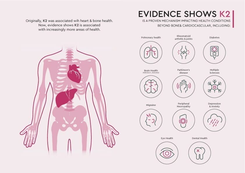
8. Anatomical
Anatomical infographics showcase a whole item, being, or structure at the center and break down its parts. It’s useful when the topic talks about parts of the human body, machinery, building levels, or something similar. It could be as simple as a plate of food with its ingredients being pointed out and explained.
9. Resume
A resume infographic is just that: the modern-day CV infused with graphic design. Although plain text resumes are still accepted, it’s more popular now to put some flair in them when applying for jobs. As a result, it’s an immediate way to express your personal branding.
Unlimited Designs at DotYeti
If you don’t have time to create a lengthy infographic, DotYeti’s got you. Our team of Art Directors and Creative Yetis like Christian guarantee that you’ll have compelling infographics.
Check out our portfolio and case studies to see how our fantastic design platform has helped our clients grow.
Worried about overpriced fees? Visit our pricing page now to learn which design package is right for you. If any of the packages aren’t a perfect fit, feel free to reach out to a Yeti today for a single service or plan out a custom package—just for you.


")