
It’s no secret that the Pantone Color of the Year announcement is a highly-awaited event. After all, this announcement quite literally determines the trends for the following year.
To represent newfound strength, Pantone has named Viva Magenta 18-1750, as the reigning color of 2023.
Bold, rich, deep, and expressive. These are the words that capture the essence of Viva Magenta in a nutshell. Expect to find this color in various everyday items next year. From your notebooks to wall decors, to hair accessories–your whole world will be warped in magenta details in no time.
Read on to find out more about what makes this color the right one for the new year.
What is Viva Magenta?
Let’s dive into the technical composition of this color first. Viva Magenta is a vibrant red with the HEX Code #BE3455. The shade can be further broken down to its RGB values, specifically: R-190, G-52, and B-85.
And although the color looks timeless, it has only been on Pantone’s roster for three years.
The hue is a deep red that has a bluish-red tone. It’s a dark carmine that doesn’t feel too overpowering. Instead, it symbolizes a quiet strength that only comes from organic strength and passion.
Leatrice Iseman, executive director of the Pantone Color Institute has called it an “unconventional color for an unconventional time”.
Behind the ‘Magentaverse’
Viva Magenta has been referred to by the institute as a hybrid color. It straddles the line between a warm and cool shade; it’s a strong authoritative red but isn’t aggressive to the eye.
In the decision process, Pantone noted a “heightened appreciation and awareness of nature represented by countless lifestyle trends.” Coming out of the pandemic, more and more people are slowly transitioning into brighter and livelier outdoor spaces. The renewed energy to travel, explore, and do sports
Furthermore, Viva Magenta also hones inspiration from the natural world. After all, its core pigment comes from the cochineal beetle. The insect produces the carmine dye which is one of the strongest and rarest natural dyes in the world. The pigment is commonly used to add color to food, cosmetics, and textiles.
Perhaps the biggest reason why magenta was chosen is the shift to artificial intelligence. The metaverse provides us with a new way to express ourselves, our strength, and raw emotion–so does this color.
As we see the development of more AI-powered technologies, it’s not surprising to see this color make an homage to the new digital world.
How to use Viva Magenta
If you’re looking for ways to incorporate this color into your designs, Pantone has kindly provided a list of pairings for you. Just take a look at these complementary shades.
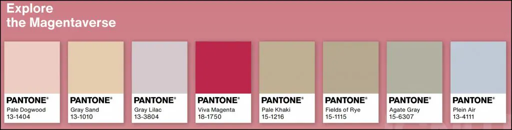
Most of these shades are on the lighter side, with faded brown and blue undertones that work well against the vibrant crimson. These neutrals pair well with the neutral brightness of Viva Magenta, which helps add a festive and refreshing vibe to your designs. Here, the colors never overpower each other. Instead, they complement each other perfectly.
In the world of graphic design, Viva Magenta is a good break from the pale and neutral colors that brands have been embracing. It’s a good hue to use for various 2023 graphic design trends. This includes minimalist retro revival, vibrant tropicalism, funky geometrical elements, and even in bold custom typography.
Stand out from the crowd with this fearless bold color palette. Furthermore, you can also use color to evoke a strong consumption in your packaging solutions.
Viva la Vida
The color red is the best color to celebrate life. Coming out of a global pandemic is a bold undertaking, and so is embracing a fun and more connected world. The fierce yet soft hue offers us strength to “weather long-term disruptive events” The strong and unconventional color is indeed a step back from the more pastel hues the institute has favored in the past.
Pantone’s yearly announcements have been a global color authority for 24 years. They dictate much of the lifestyle trends during modern times. Especially in the construction and art world–anything that has to do with color.
Anywhere from the beauty industry, to the fashion and interior design fields. The past year’s picks have all been derived from the natural world, such as Veri Peri.
Pantone Color of the Year 2024: Peach Fuzz
Find out more about Peach Fuzz, the gentle peach color designated as Pantone’s Color of the Year 2024.
Want a graphic design agency to incorporate meaningful color theory into your brand?
DotYeti has designers who are well-versed in current design trends. If you want to bring unique designs to your business, sign up now for only $449 a month!


")